
A solution to avoid cluttering the home with many toys.
Overview
As a parent, I noticed how quickly toys pile up—some sold, some given away, many unused. What if parents could rent toys from each other instead of buying new ones, testing them first for a small fee?
ADDING A FEATURE TO AN EXISTING APPLICATION
MY ROLE
Product Designer, Research
DURATION
90H
TOOLS
Figma, FigJam, Chat GPT, Zoom
SKILLS
User Research, Testing
The problem
Toy Owners: unused toys take up space and often go to waste.
Toy Renters: high costs and clutter, unsure if a toy will suit their child.
The solution
I designed a Vinted toy rental feature, enabling 3–6 week rentals with secure payments and deposits. It helps parents test toys without commitment while reducing clutter, extending toy life, and promoting sustainability.
Research
Pivoted from swapping toys
→
to renting toys after interviews.
Initial assumptions focused on parents swapping toys, but after user interviews I pivoted to a rental model, which better addressed convenience, trust, and cost concerns.
Pain points
Thanks to creating an affinity map, users' pain points became clearly visible.

01 Toy Overload & Storage 80%
Feeling overwhelmed by the lack of space and the growing number of unused toys at home.
02 Suitability & Usage Concerns 80%
Many toys go unused as children lose interest quickly, making purchase feel risky.
03 Financial Consideration 40%
High- quality toys are expensive, making rental an appealing, budget-frindly aletrantive.
04 Travel & Temporary Toy Needs 40%
Need for toys specifically for travel or short periods away from home.
Business Value

Opens a new category in Vinted, attracting families with kids.

Provides a new revenue stream through cutomer protection

Supports Vinted’s sustainability positioning, reinforcing brand values.
Main Takeaways from Market Comparison
From a UX perspective, I decided to separate OLX from other Polish rental platforms due to a key difference in how users interact with each. OLX is a peer-to-peer marketplace with minimal structure or guidance — low cost but high cognitive load and risk. In contrast, toy rental platforms offer curated, secure experiences with clear flows and support, leading to higher trust but also higher costs. This difference significantly impacts user expectations, usability, and perceived safety.
TOY SELECTION
FIGLISTO / TOY SURFING / BEELAGOM: Pre-curated sets, no freedom to choose specific toys
OLX: No toy filtering, not child-focused
COST
FIGLISTO / TOY SURFING / BEELAGOM: High monthly fees (130-150 PLN)
OLX: Varies; unclear pricing structure
RENTAL FLEXIBILITY
FIGLISTO / TOY SURFING / BEELAGOM: Monthly-only subscriptions; no short-term options
OLX: No rental period managemenT
LOGISTIC
FIGLISTO / TOY SURFING / BEELAGOM: Packing, shipping delays, returns required
OLX: Entirely manual, user-dependent
POPULAR BRANDS
FIGLISTO / TOY SURFING / BEELAGOM: Few licensed toys (e.g., LEGO, Barbie)
OLX: Depends on user listings; no quality control
TRUST & SAFETY
FIGLISTO / TOY SURFING / BEELAGOM: Moderately secure, but still platform-limited
OLX: Risk of scams, no protection or deposit system
SYSTEM INTEGRATION
FIGLISTO / TOY SURFING / BEELAGOM: Some automation but limited customization
OLX: No rental flow, calendar, or deposit handling
An opportunity for Vinted
This distinction is actually a key opportunity for a platform like Vinted to offer a toy rental feature: combining OLX's peer flexibility with the structure and safety of a specialized platform.
Define
User Persona
Based on the information gathered from the research, I created two user personas — one representing a person listing a toy for rent and the other representing a person renting a toy through the platform.

Elena
Goals
Keep the toys without the need to store them
Unclutter the house
Earn some money
Pain Points
A lot of toys that are no longer in use but clutter the house
She doesn’t want to sell them
Needs
Elena seeks a platform to monetize her unused toys, declutter her home, and benefit from items she doesn't want to permanently sell.

Sarah
Goals
Don’t spend too much money on toys that she likes
Not to clutter the flat
Care for the environment – fewer new plastic toys, more second-hand wooden ones
Pain Points
High quality toys are expensive
The child loses interest too quickly
Small flat
Needs
Sarah needs an affordable, eco-friendly way to access desired toys temporarily without cluttering her small home.
CUSTOMER JOURNEY MAP
Understanding the user’s experience step by step
By mapping the customer experience, I identified critical points where the app needs to build user trust, ultimately leading to greater transaction satisfaction. The most important information is marked with a circle.

Elena
| Awareness | Discovery | Engagement | Interaction | Satisfaction | |
|---|---|---|---|---|---|
| Steps | Elena has an idea about improving her writing skills. | She searches for resources to improve her writing skills. | She discovers the service, looks for the subscription plans, and registers for a free trial. | After trying the trial version, she decides to subscribe and goes through the payment process. | After a month, she received a notice on her mobile to renew the subscription. |
| Goals | Find a way to improve her writing. | Find a service that is suitable for her writing style and needs. | Test the service. | Finish the shipping process and check for the tracking and delivery dates through a purchase box. | Get a positive user experience, and renew the services. |
| Pain points | She doesn't have time for courses, so she needs another kind of service to get help with. | She cannot find any reliable information about how to use the service. | The service usability is not meeting her needs and she thinks the price is high. | Finding the proper plan is not an easy task, forcing the user to go back and forth while selecting the plan. | Pricing policy. |
| Feelings | |||||
| Opportunities | Show relatable content about personal improvement. | Use social media to promote the service and create a blog where we can post about success cases of other users. | Emphasize user's main needs on the home page with a call to action. | Give the user a clear and confident path to follow, maybe create a feature that compares the subscription plans. | Better customer engagement. |
| Used Features | Laptop | Blog Posts, Reviews, Videos | Page for pricing, Home screen | Notifications, payment checkout, including the shipping label. | Push notifications, renewal messages, social media, subscription plan. |

Sarah
| Awareness | Discovery | Engagement | Interaction | Engagement | Satisfaction | |
|---|---|---|---|---|---|---|
| Steps | Logs in to Vinted app, exploring available toys. | Discovers there's a feature to rent a second hand toy from another user. | She finds nice wooden blocks in her kid's age category. The price seems reasonable. | After a few hours she gets a notification that her toy is shipped. It's delivered after two days. | After a month she prints out a shipping label and sends it back to the owner. | The owner confirmed that everything is fine with the toy. She gives a positive review for the renter. |
| Goals | Looking for a nice toy for her daughter. | Discovers she doesn't have to buy it and later deals with it. | Rent the toy. | Take it out from the parcel box and checked if everything is fine with the toy. | Pack it well and ship it. | Get a good review. |
| Pain points | She usually buys second hand toys but after short time she has to list them for selling. | She doesn't know how it works and she is worried that she forgets to send it back or her kid will damage it. | She has to pay the deposit upfront. | If something is wrong with a product she will have to take pictures of it and send them to the renter. | Will the parcel reach the owner, and will her deposit be unfrozen? | All is good. |
| Feelings | ||||||
| Opportunities | Second hand toys are usually in good shape and much cheaper than new ones. | She can test if her kid likes it and if not she won't clutter her flat and spend more money on it. | These wooden blocks, even second-hand, cost a lot if she were to buy them. And they would probably be a toy for only a week, like all other toys for her child. | Once the toy is delivered and everything is fine, she can give it to her daughter to play with. | She can rent the toy again in future when her kid is older and more eager to build using blocks. | She gets her deposit back, she can rent another toy. |
| Used Features | Log in to app | New icon of "Rent Toys & Games" | Uses Filters for wooden toys and 2 year old kids. The item's page. Shipping information. Payment page. | Notification, confirmation. | Notification that renting period is over, shipping label. | Notification, review page. |
How might we help parents temporarily declutter and gain a financial benefit from unused toys?
How might we provide parents with a way to access toys for a limited time?
Ideate
Task flows
While creating the task flows, the user goes through the same steps that are currently required in the app to list a product for sale or to search for and purchase one. In the case of user flows, I anticipated the users' next steps after the rental period ends, as well as situations where the toy is returned damaged.

Design
How other platforms do it
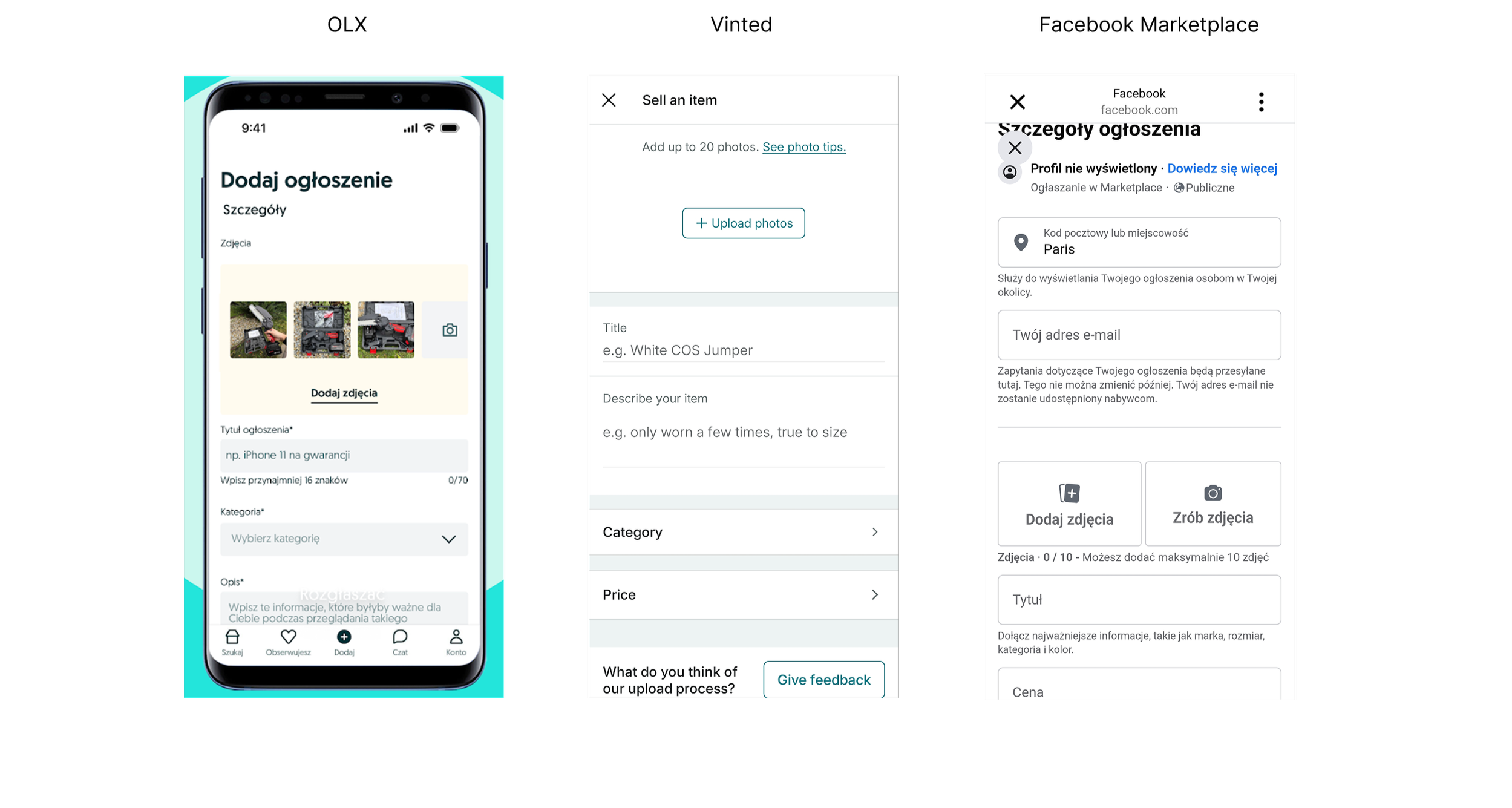
I compared Vinted’s UI with Amazon, OLX, eBay, and Facebook Marketplace, which all let users buy, sell, or rent items. This helped me spot UX gaps and best practices to inform my design decisions.
Adding an ad
These platforms share similar purposes, making them useful for UI comparison. OLX’s subtle category tips guide users effectively, while both OLX and Vinted prioritize photos at the top for clarity and engagement. Facebook Marketplace emphasizes location, showing how platform priorities shape UX.
Checkout
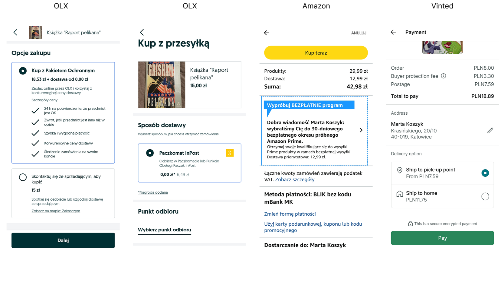
OLX lets users opt in or out of a protection package, with clear details and optional free shipping. Vinted doesn’t offer this choice. On Amazon, the prominent Buy Now button can lead to accidental purchases, bypassing order review.
Following Vinted’s Design System
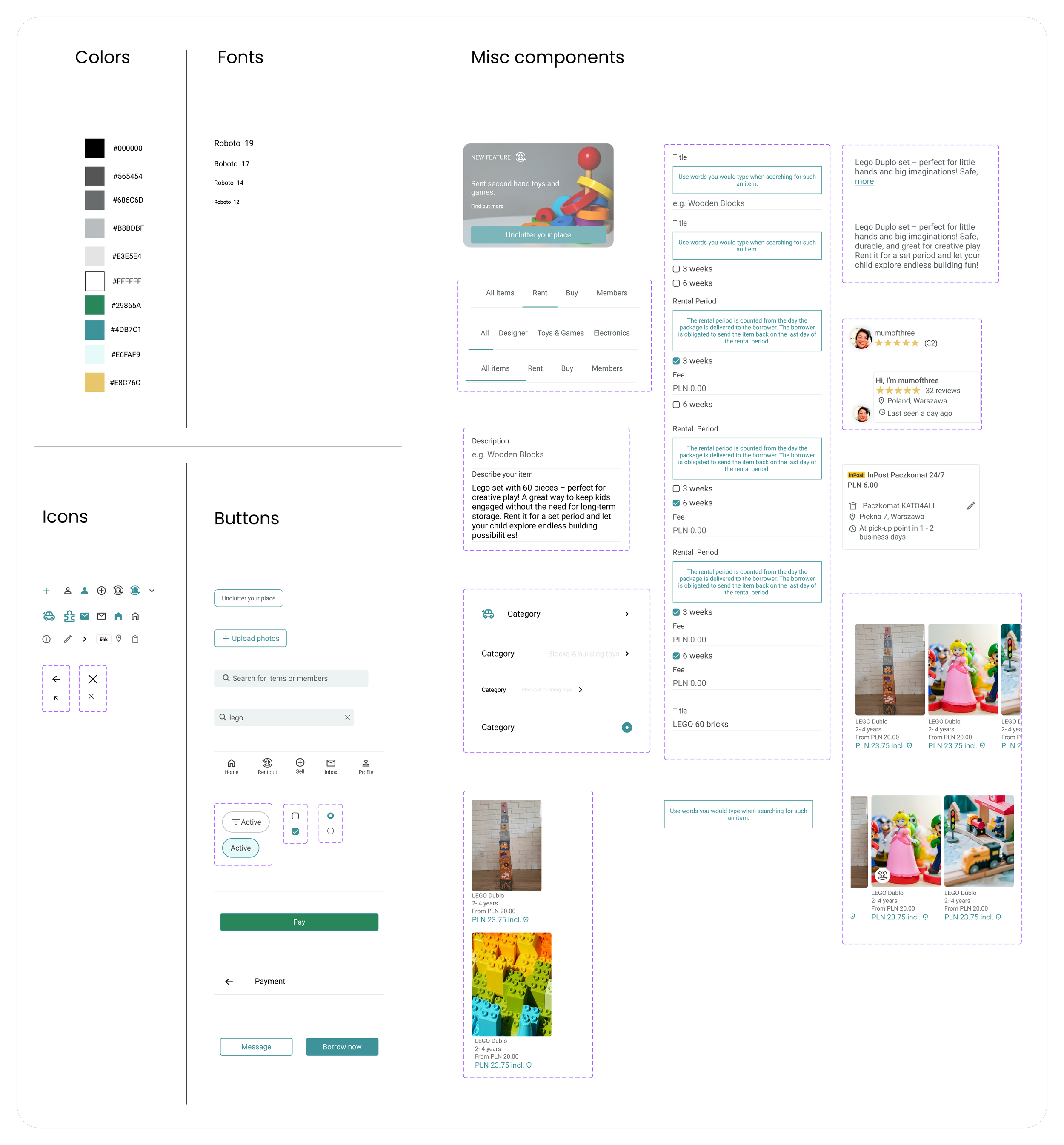
While working on the mid-fidelity wireframes, I also created the UI kit for the project. Since Vinted has an established design system, I researched its existing styles, typography, and components to ensure consistency. Using these insights, I carefully built the UI kit to support a cohesive and seamless integration of the new feature.
First drafts- low fidelity wireframes
While designing the initial wireframes, I had to keep in mind that I was introducing a new feature into an already well-known and widely used app . Therefore, I based my work on the existing patterns Vinted uses for buttons and item searches, adding and integrating the elements related to the new renting feature into the overall design. The main idea was to ensure that users would, first of all, notice the new feature, and secondly, be able to use it just as easily as they currently use the sell/buy functionalities.
Landing page
Considering it’s a new feature, should the informational box introducing it be made more visible to ensure user awareness?

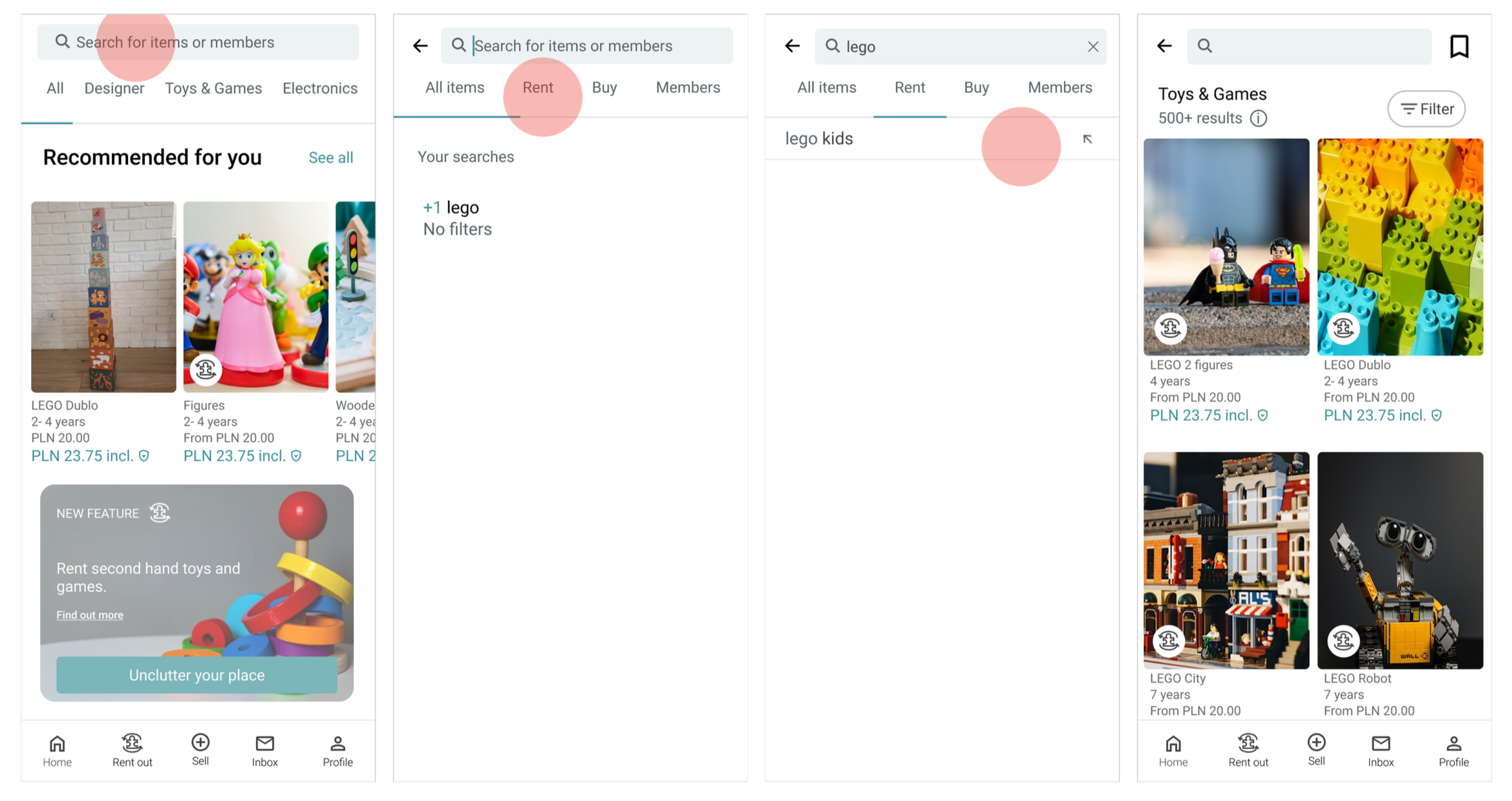
There are two possible ways to search for an item to rent from another user: by using the search bar and then filtering the results to show only items available for rent, or by clicking on the suggestions at the top of the homepage.
To add a toy rental listing, the user can enter via “Unclutter your place” or “Rent out.”
Version 2 won.
In this case, I decided to stick with Vinted’s layout and keep the information box below the "Recommended for you" section.
Ad page
How to label a listing so it's clear that the item is for rent, not for sale?

Version 2 won.
To avoid overwhelming the user, I used a rental icon on the product image and placed the explanation about how renting works at the bottom of the listing — allowing the product to capture attention first.
Payment page
Should I keep Vinted’s original layout on the payment page (version 2)?

Version 1 won.
Since the total price depends on the selected delivery option, it makes sense to display it underneath — where it can dynamically update as the user makes a choice.
Test
Key findings from low-fidelity usability wireframe testing
“I'm not sure for how long I can rent a given item.”
#3 Participant
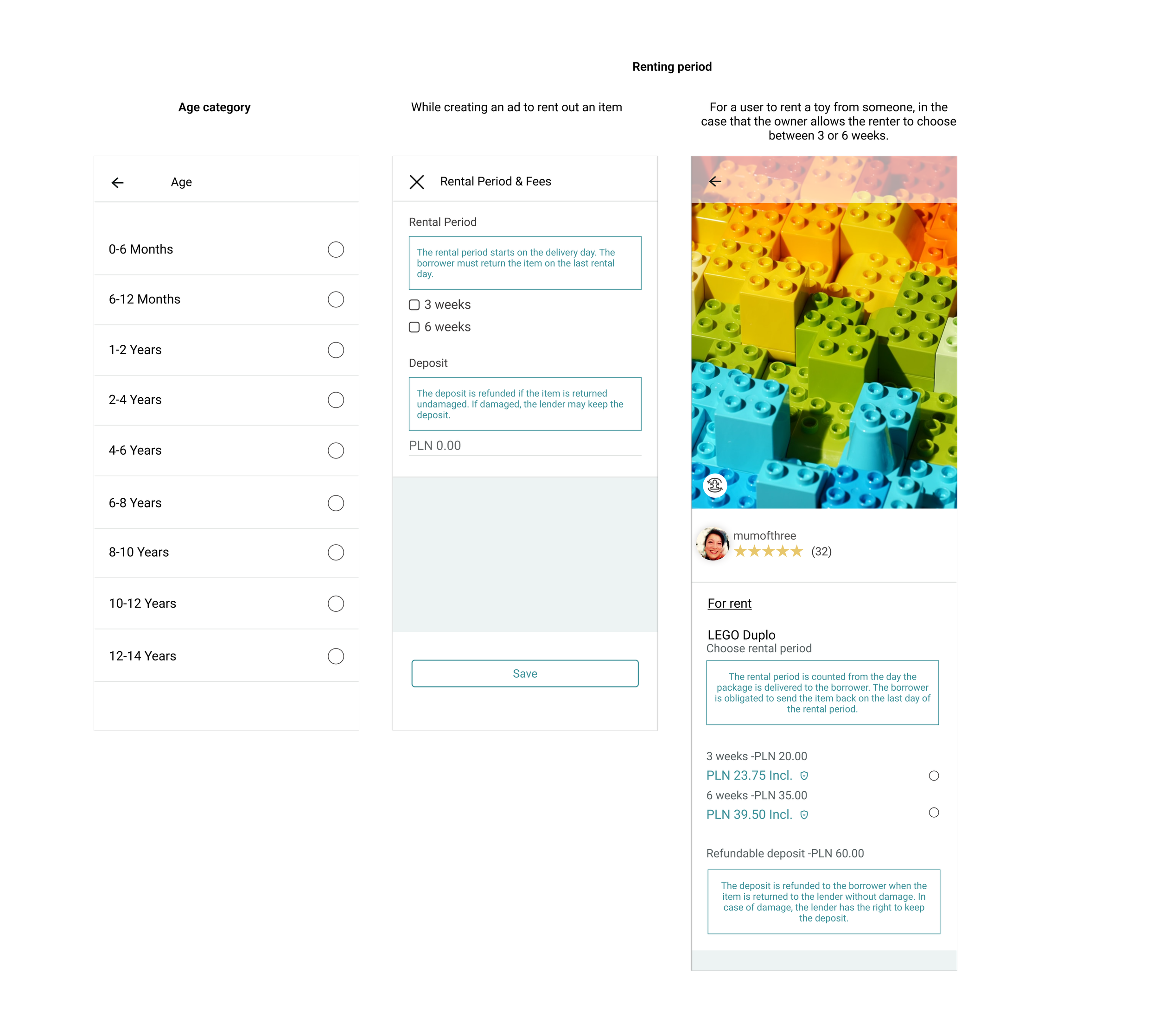
“An age category would be useful.”
#5 Participant
Implementing improvements based on usability testing
After implementing improvements based on usability testing, I moved on to designing the high-fidelity wireframes. I integrated the new feature into the app's existing color scheme and layout to maintain visual consistency.
It was important to me that each screen guides users through the process smoothly and intuitively, without unnecessary frustration — staying true to the user experience patterns familiar from Vinted, while remaining easy to follow for new users.
Key iterations
OUTCOME
The term "Borrow" caused confusion during usability testing, as users associated it with free lending. To improve clarity, it was replaced with "Toys & Games", making the category label more intuitive and aligned with user expectations.

OUTCOME
The summary of rental period, fee, and deposit was added after users reported uncertainty about saved inputs. This change improves clarity and confirms that details were successfully entered.
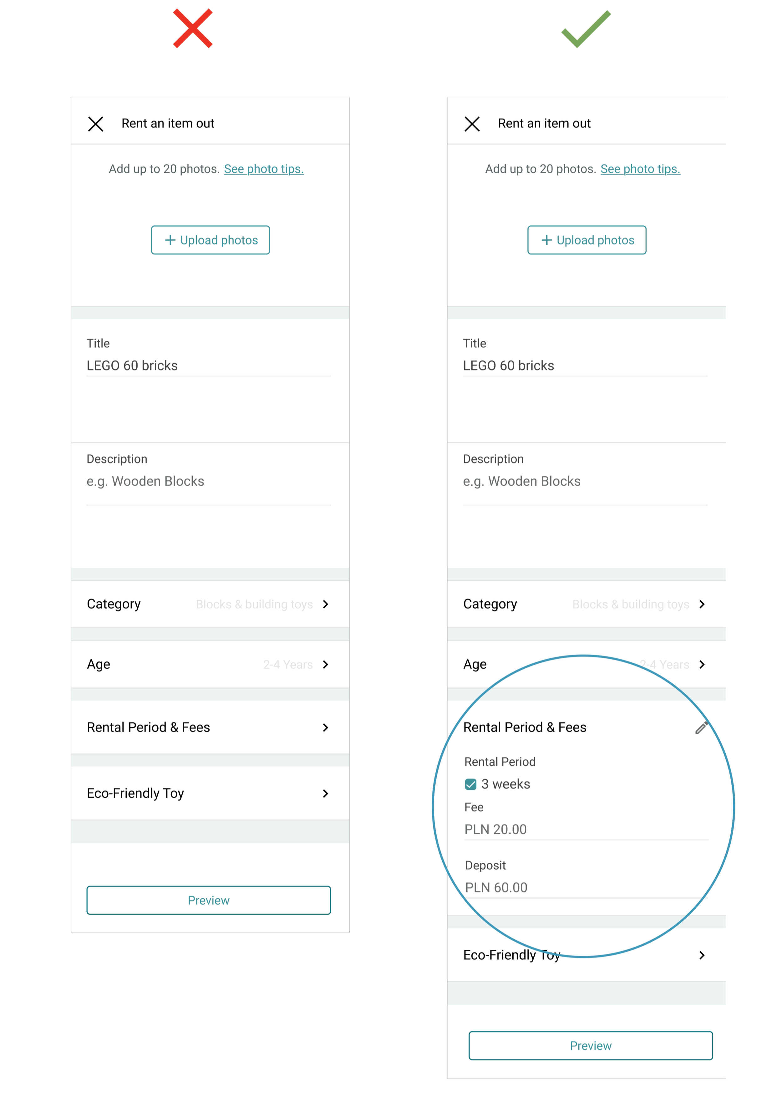
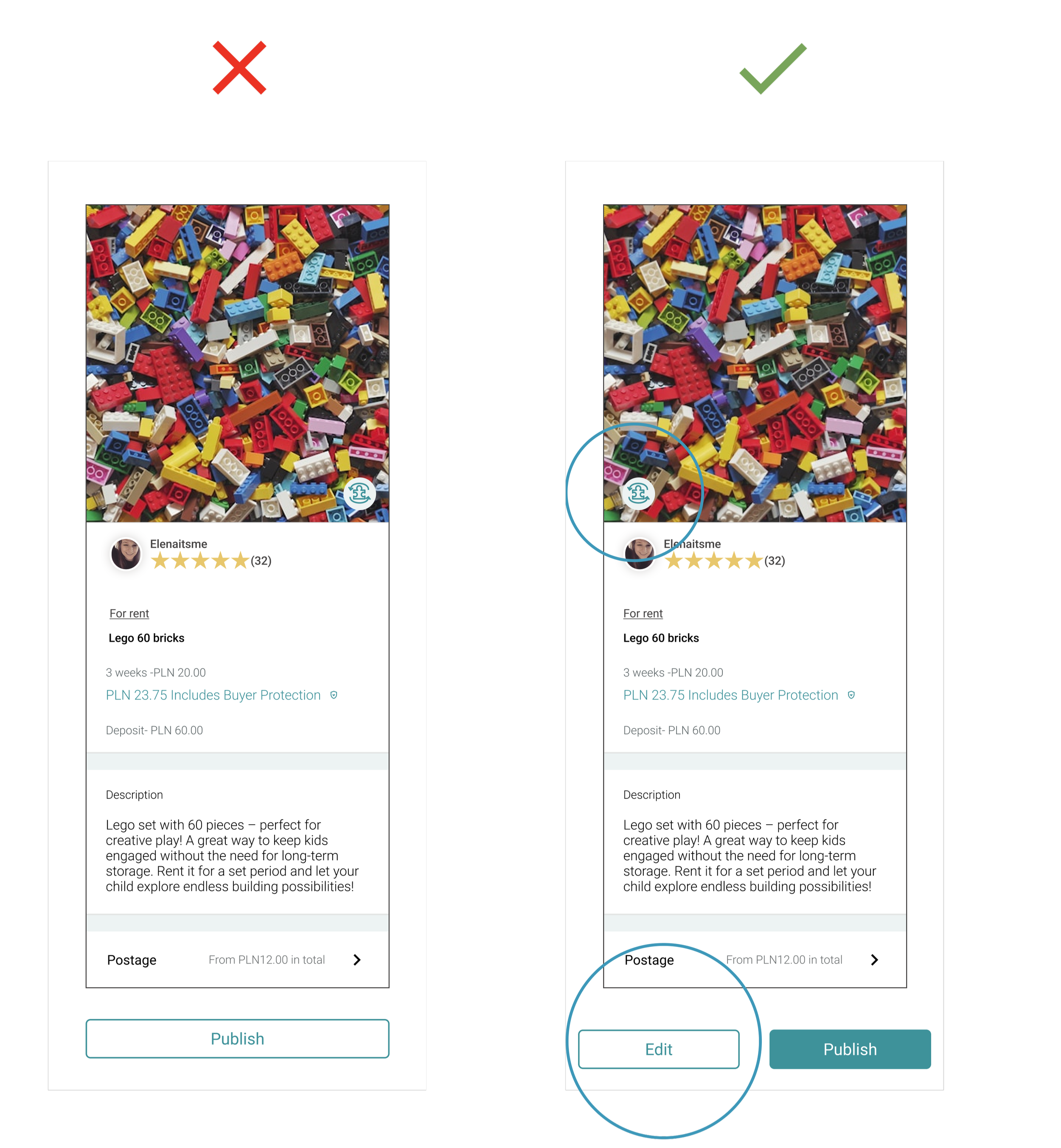
OUTCOME
The "Edit" button was added after users requested an easy way to make changes before publishing, improving flexibility and control.
I initially didn’t design a full filtering option. However interviews showed users often browse toys without intent to buy, so filters are crucial to surface items that catch their interest.
OUTCOME
Filtering search results – users can easily apply filters to view only items for sale or for rent, making the search process more efficient and tailored to their needs.
#1 Possibility
#2 Possibility

Deliver
Final design
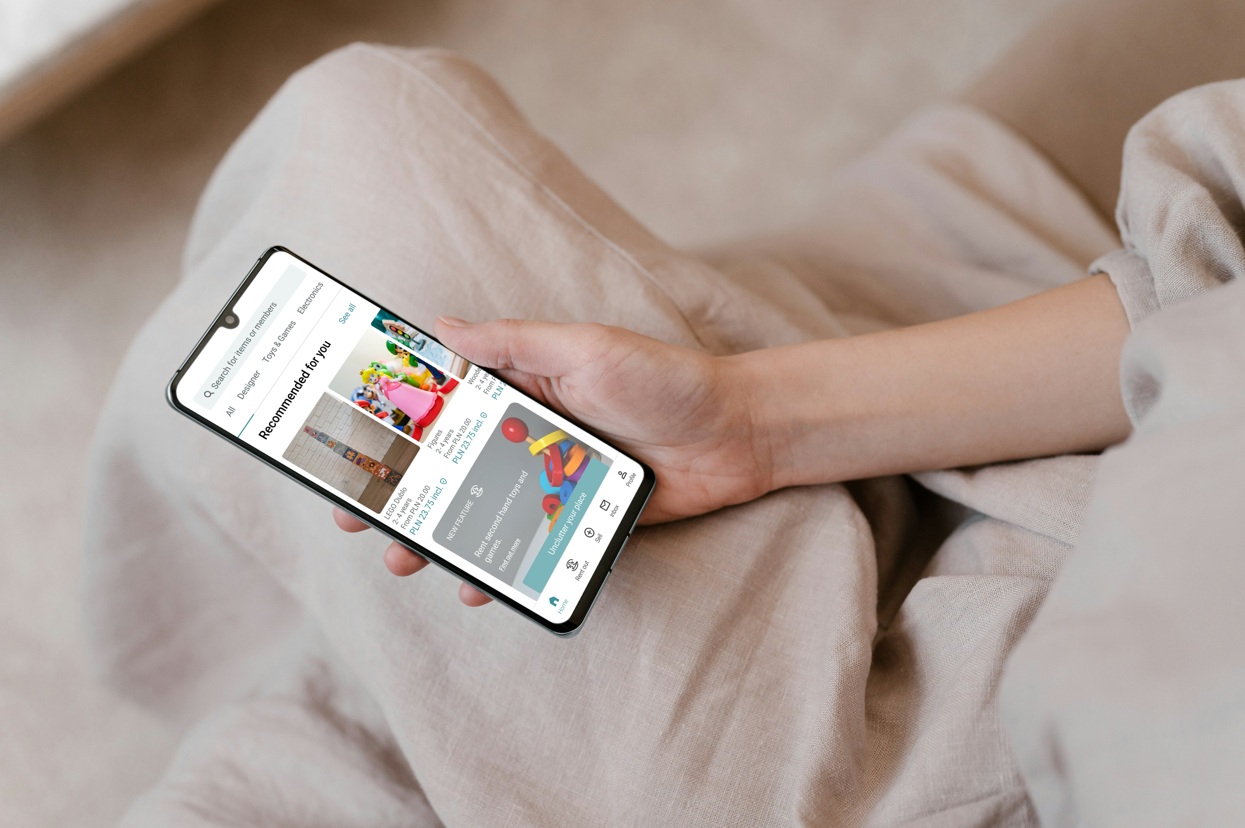
The feature lets users rent or list second-hand toys for 3–6 weeks, giving parents affordable, flexible access without clutter.
Listings are simple and secure, with availability, fees, and deposits clearly set.
This extends toy lifespans, reduces waste, and adds a new revenue stream for Vinted while enhancing user retention.
Add an item
Search for an item

Potential Success Metrics
As this was a concept project, I didn’t track real data. However, if implemented, success could be measured by:
Adoption
% of parents willing to rent toys at the proposed priceEfficiency
Average time to find & complete a rentalRetention
% of users renting again within 3 months
Takeaways
This was my first project involving the integration of a new feature into an existing product — in this case, the well-established and widely recognized Vinted app. I had to adapt my concept and vision to fit within Vinted’s existing design system and user expectations.
The choice to design a toy rental feature was inspired by both my own experience as a parent and the needs expressed by other parents, combined with the app’s strong presence in Poland. Although I began with a clear initial idea, research quickly challenged and reshaped it, showing me just how powerful user and market insights can be in influencing the direction of a project.
To propose a meaningful solution, I also needed to explore Vinted’s business model, along with similar platforms, to ensure the feature would bring value not just to users, but also to the business itself.
This project significantly contributed to my growth as a designer. It deepened my understanding of designing within real-world constraints — from adhering to an existing design system to aligning with business objectives. It also strengthened my ability to stay flexible, listen to users, and iterate with intention. More than anything, it taught me the importance of balancing creativity with strategy and how impactful user-centered thinking can be in shaping a valuable digital experience.
What I liked the most
Working on the Vinted toy rental feature was one of the most rewarding projects I’ve done — both creatively and strategically. Here’s what stood out:
1. Designing with Purpose
This feature directly responded to real user needs while promoting sustainable consumption. It felt meaningful to contribute to a solution that helps parents reduce clutter and encourages reuse over buying more.
2. Letting Research Shape the Direction
One of the most valuable takeaways was learning to pivot. My original idea was completely redefined through user interviews, showing me how essential research is in building the right thing — not just building it right.
3. Creating Within Real Constraints
Integrating a new feature into an existing product like Vinted required discipline. I had to align with their established design system, which taught me how to innovate while respecting brand consistency.
4. Balancing User & Business Goals
Beyond user experience, I explored the business side — including monetization, platform trust, and logistics. I aimed to design a feature that benefits both users and Vinted’s long-term strategy.
5. Iterating Based on Usability Testing
Seeing real users interact with the prototype brought the design to life. Their feedback directly shaped the final solution, and it was incredibly rewarding to implement improvements that made the product smoother and more intuitive.