
overview
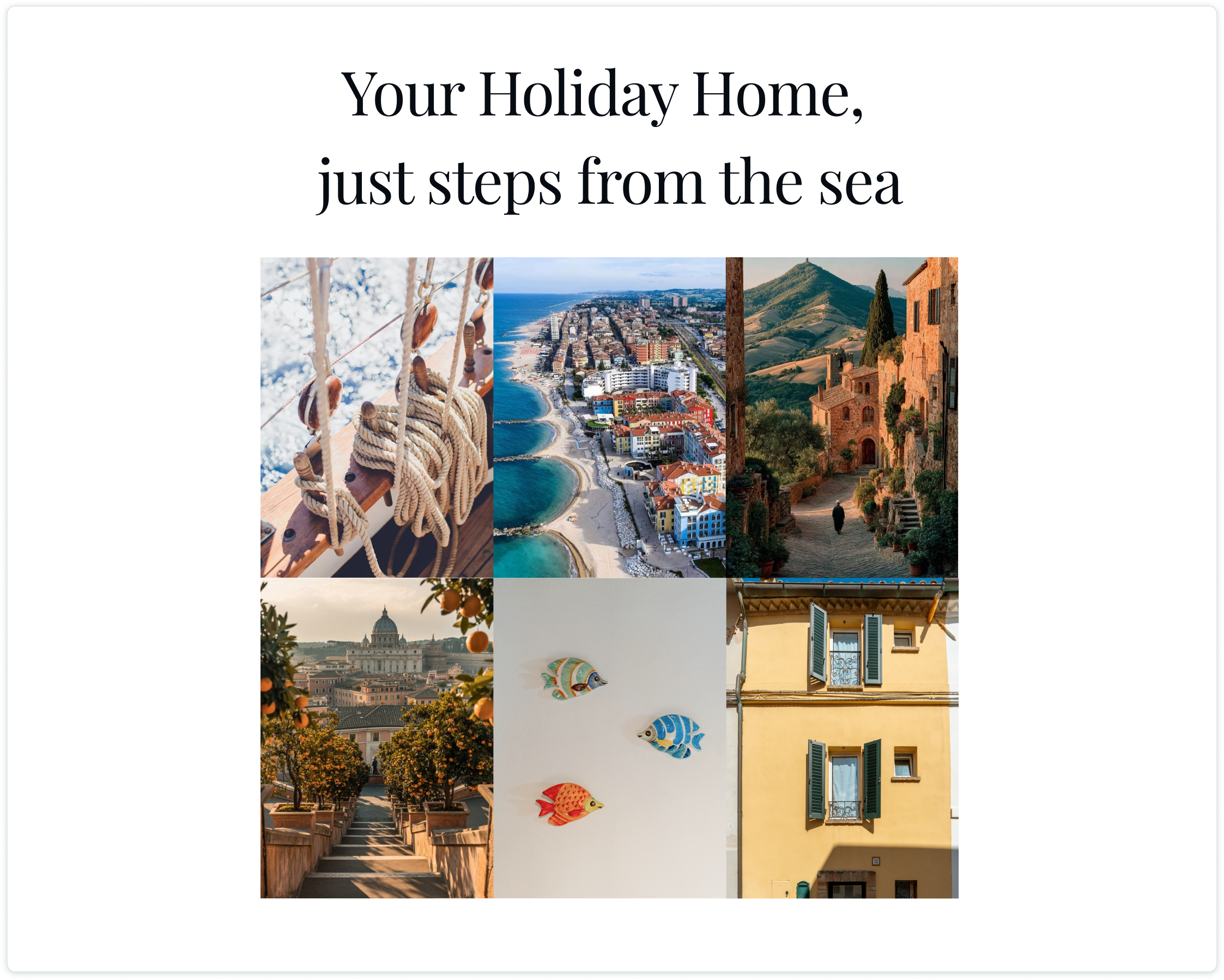
This ongoing project focuses on designing a simple and elegant website for a family-owned holiday home in Italy.
The goal is to help the owners move away from booking platforms and attract guests directly through a personal, trustworthy digital presence.
responsive website (figma protytype)
client
my role
Owners of the holiday house
Product Designer (UX/UI & Research), Developer
duration
October 2025- ongoing
tools
Figma, FigJam, Gemini, Zoom, Illustrator, Cursor, netlify.com
business problem
The owners of a holiday home in Italy get many guests through word of mouth.
Until now, they have only advertised on Booking.com, but they would like to start moving away from such platforms due to high fees and the fact that many potential guests come through personal recommendations.
design challenge
how might we design a website that:
presents the holiday home in an attractive and trustworthy way,
allows users to quickly contact the owners,
supports three languages (Italian, Polish, and English),
works seamlessly across both desktop and mobile devices
opportunity
They need a simple website for the house — a digital “business card” that they can share directly with potential guests to showcase the property, instead of sending a Booking.com link.
research

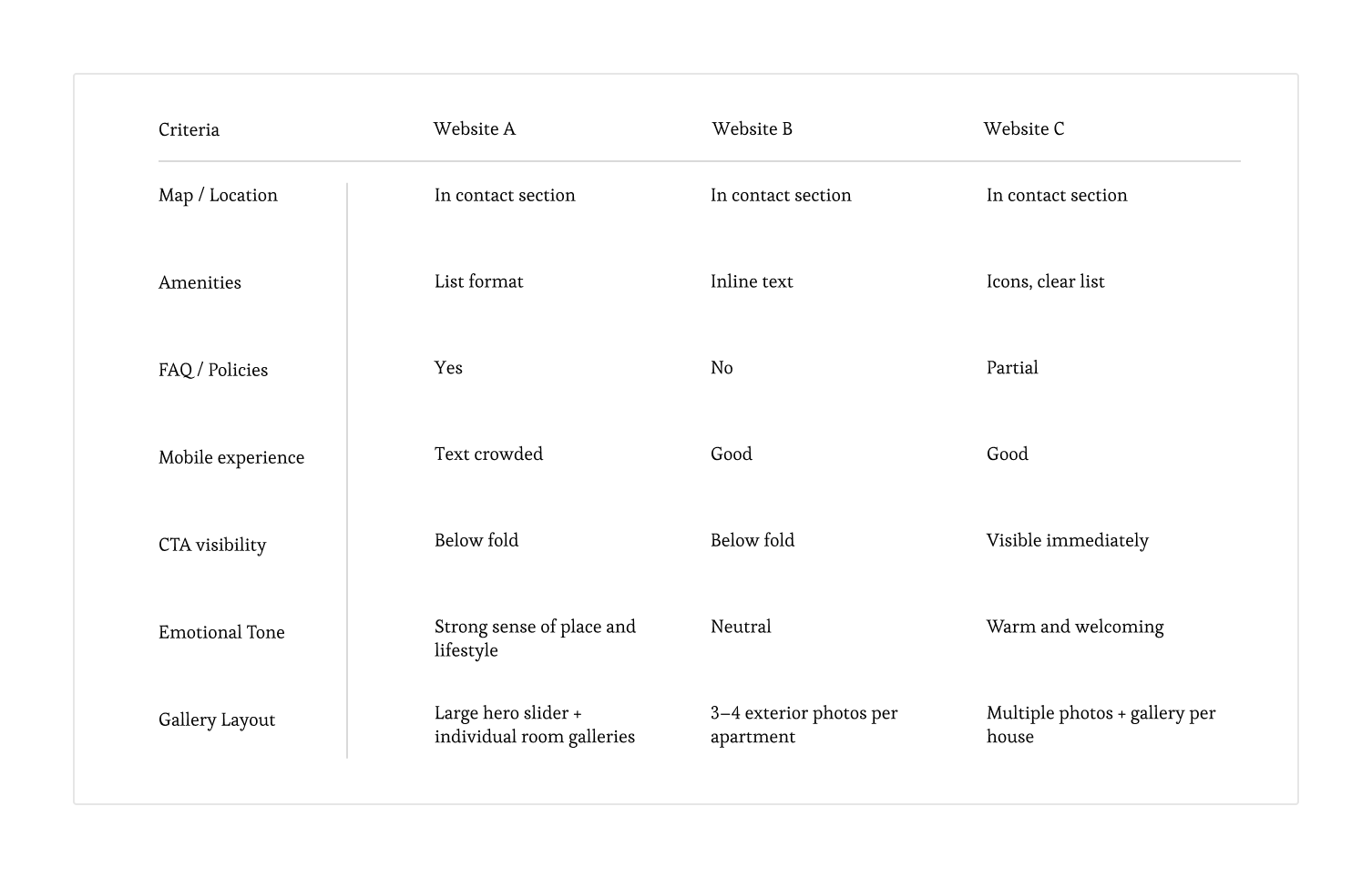
comparative analysis
To better understand design patterns and user expectations for small-scale accommodation websites. I analyzed three competitor websites (referred to here as Website A, B, and C) — all representing small-scale Italian vacation rentals — to identify patterns in storytelling, usability, and design.
review analysis
I conducted qualitative analysis of Google Maps reviews. Thematic coding was used to uncover patterns, praised features, and emotional tone. This fast, low-cost approach provided authentic insights into user motivations and perceived value.
key findings:
Three recurring themes emerged from guest feedback, defining the core strengths of Casina al Mare.
01 the primacy of location is the key motivator
The location is the main driver of guest satisfaction.
beachfront access: Guests emphasize being “right by the sea” or “1-minute walk” - the top-rated benefit.
authentic atmosphere: Appreciated for its safe, friendly town away from crowded resorts.
convenient base: Close to restaurants and shops, ideal for exploring the Conero Riviera, especially by bike.
02 a well-equipped & clean space reduces friction
Guests praised the house’s excellent condition and comfort.
well-equipped: Frequent mentions of having “everything needed,” including a kitchenette and towels.
cleanliness: Consistently described as “clean” and “very neat,” meeting key guest expectations.
03 the host as a key differentiator
The host, Alessandro, was frequently mentioned by name and praised for his role in the guest experience. This personal touch is a significant competitive advantage.
helpfulness: Consistently described as "wonderful," "very helpful in every matter," and proactive in offering information. This transforms the stay from a simple rental into a hosted, welcoming experience.
translating research into design strategy
These findings directly informed the core strategy for the website's design and content:
lead with location
build trust through the host
prove the promise of comfort
google search analysis: identifying user intent & content opportunities
To shape the website’s SEO and content strategy, qualitative analysis of Google’s Autocomplete and People Also Ask results (in Polish and Italian) was conducted. This revealed what travelers actively search for when planning holidays in the Marche region.
01 core search themes
seaside holidays – focus on “al mare,” “beach,” “most beautiful sea.”
family travel – strong interest in “vacanze con bambini.”
local experiences – searches for Conero Riviera, cycling, maps, weather, and restaurants.
02 content gaps
Users seek trip-planning guidance, not just accommodation — e.g., “What is Marche famous for?” or “Best beaches in the region?”
03 planning context: timing & budget
Queries show focus on specific dates (e.g., Easter, August) and budget-conscious choices (“spendere poco”).
recommendations fot the project
01 add a “Region & Activities” section answering common travel questions.
02 include practical info (map, weather, restaurants).
03 integrate key phrases like “seaside holiday,” “family apartment,” “near the beach,” and “cycling in Marche” throughout site copy.
define
user persona
The user persona was developed from an analysis of the property's actual guests to ensure it faithfully represents the needs of the true target audience.

name: Anna, 34 — married, two kids
location: Large city, works in a corporate environment
context: Planning summer holidays with her family
goals:
Find a cozy, authentic place close to the sea
See real photos to confirm the house fits her family’s needs
Quickly check availability and contact the owner easily
frustrations:
Websites with too much text and poor-quality photos
Lack of clear information (e.g., child/pet policy)
Hidden pricing and no quick contact options
needs from the website:
Large, authentic photos (interior and exterior)
Clear, concise practical information
Immediate contact options (WhatsApp, email)
ideate
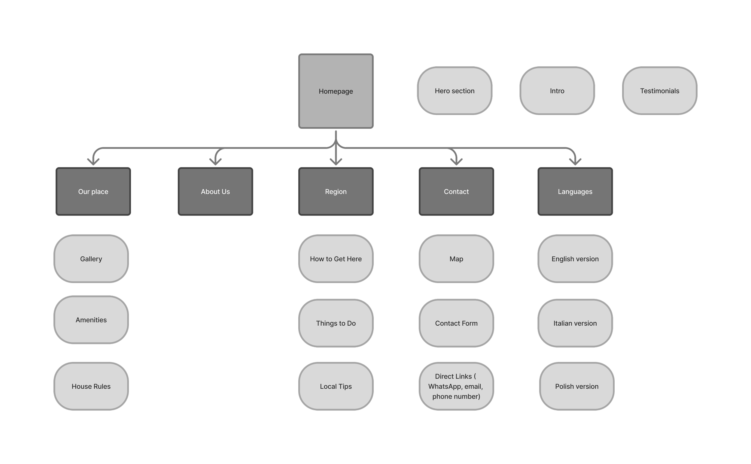
sitemap
The main navigation was divided into five key pillars, answering the user's fundamental questions: What is this place? (Our place), Who is behind it? (About Us), Where is it and what can you do there? (Region), How to get in touch? (Contact), and language versions (Languages).
Secondary elements are content sections within a single page rather than separate subpages. The structure is designed to keep navigation simple and intuitive for international guests.
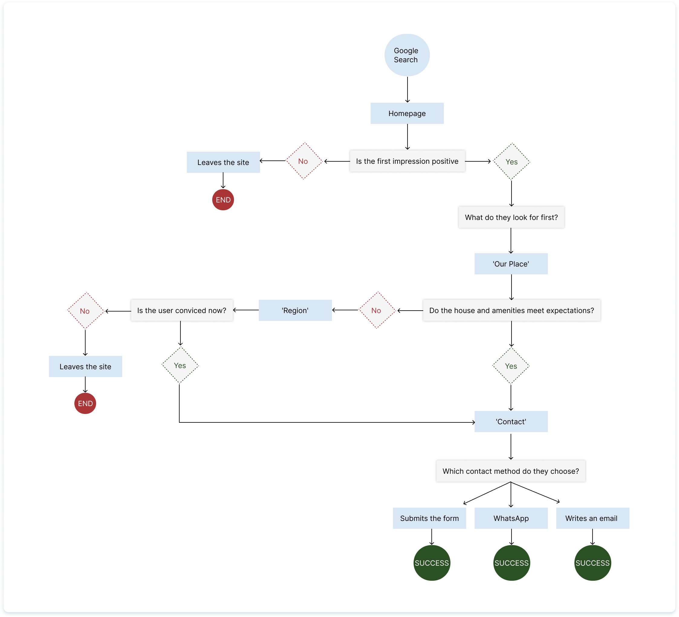
user flow
This user has landed on the site from Google or a recommendation. They are not ready to book; they want to gather as much information as possible and then ask a specific question.
design
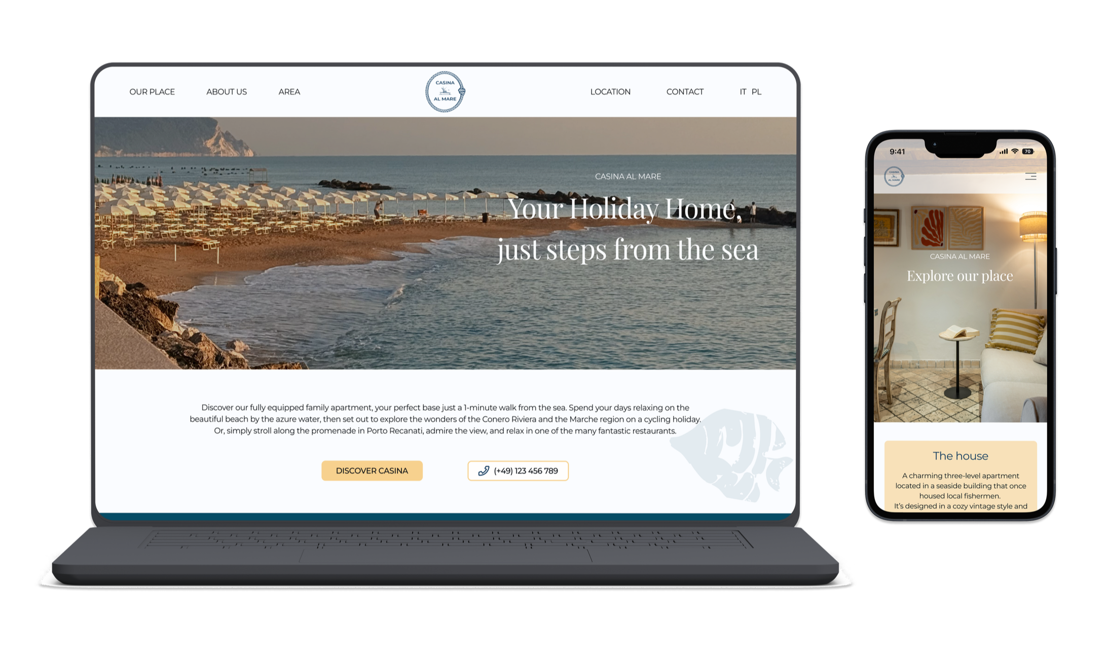
desktop low fidelity wireframes
Low-fidelity wireframe proposals for the client to illustrate how many photos should be included, where they should be placed, how they should be presented, and to visualize the overall layout with other elements.
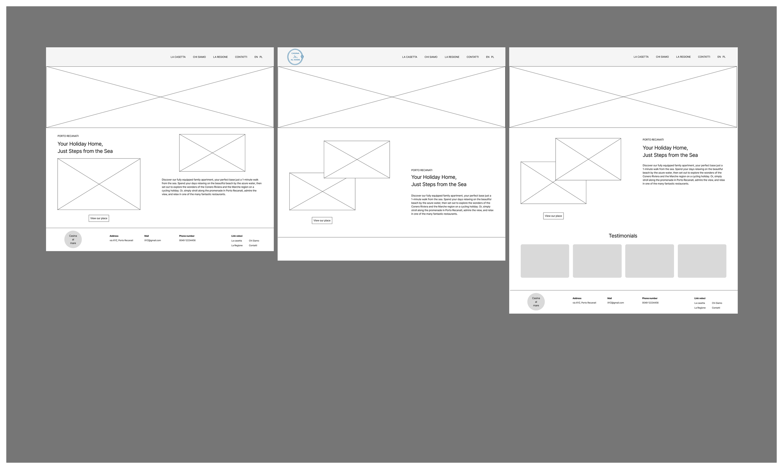
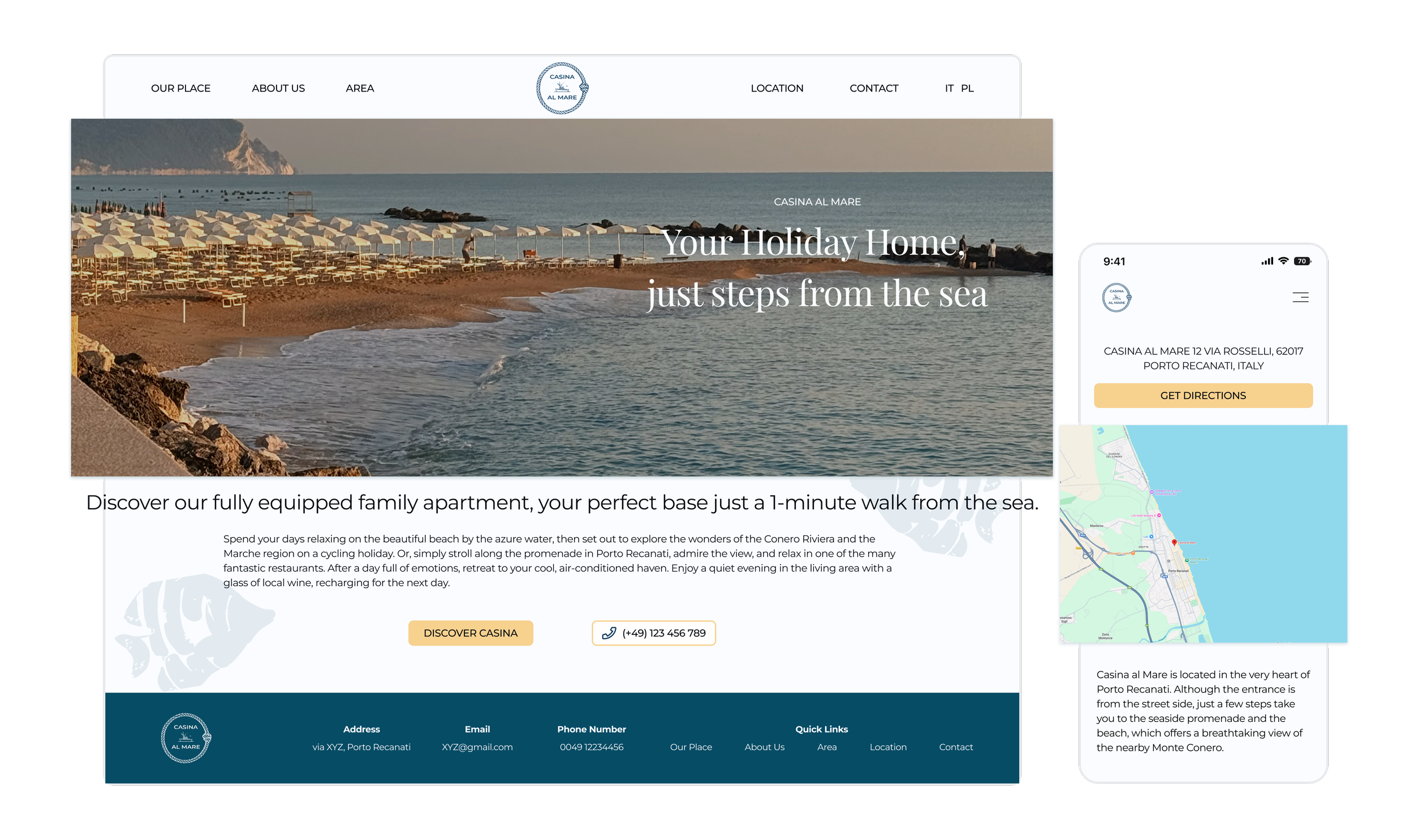
landing page
The client had some doubts about whether the testimonials should appear on the homepage or under the "Our Place" section.
The middle option was chosen.
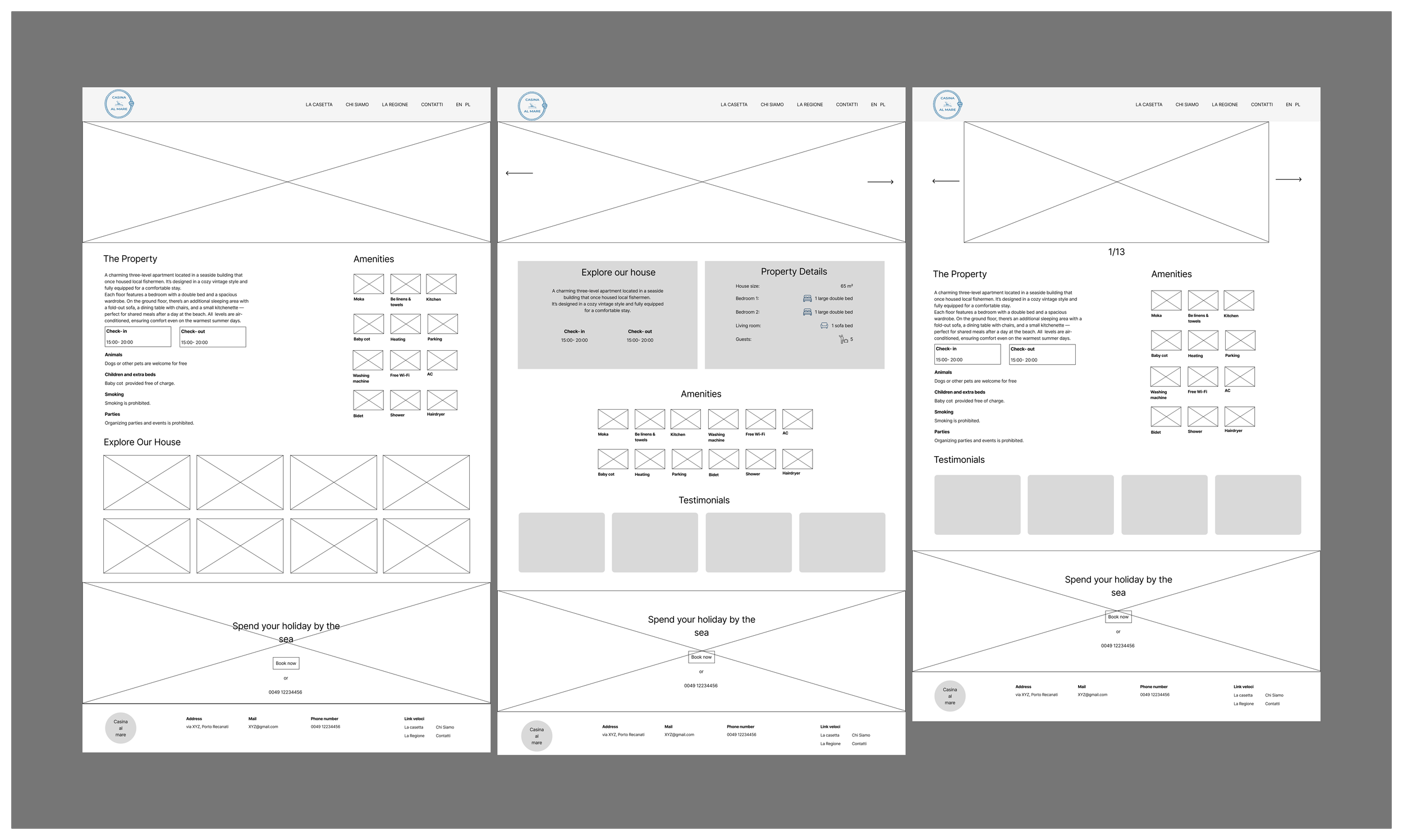
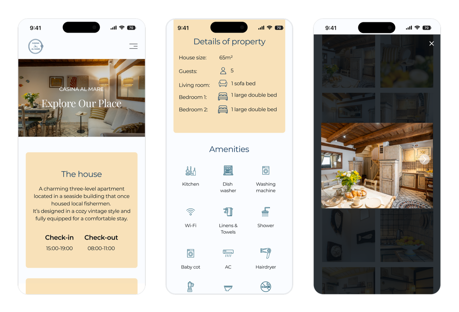
the house’s page
The focus was on finding the most effective way to present photos and key information to ensure clarity and readability.
The client chose the gallery layout from the first wireframe, allowing users to instantly see all available photos and click on the ones that catch their interest.
When it came to the arrangement and amount of information about the cabin, the layout from the middle wireframe was selected as the most balanced and user-friendly option.
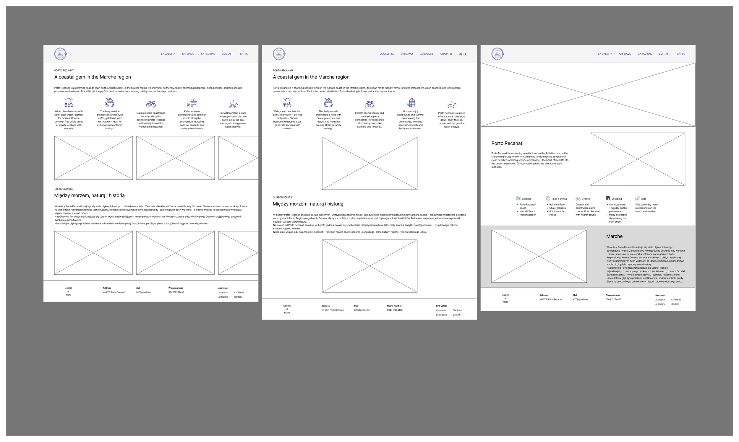
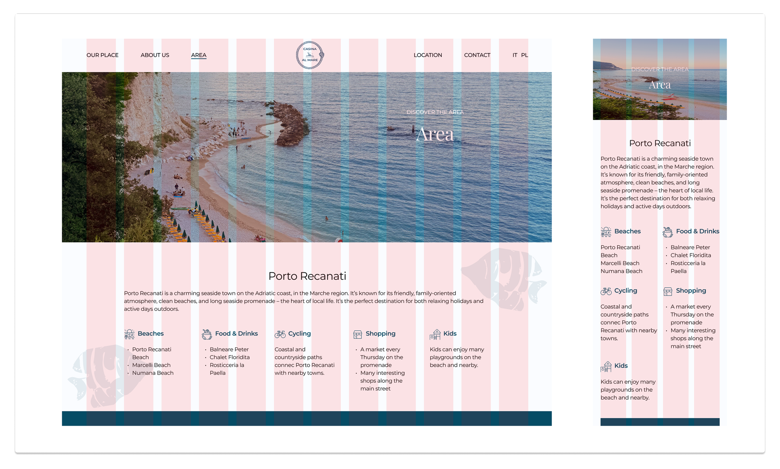
“area” page
The goal was to find the most effective way to present both the regional photos and the key information on the website to ensure clarity and readability.
The client chose the gallery layout from the third wireframe.
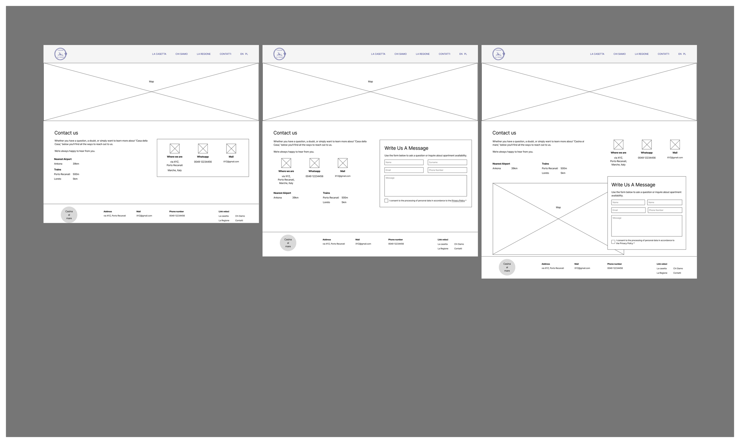
“contact” page
The client wanted to see versions of the page, one with a contact form and one without. There was also some uncertainty about where to place the map. Ultimately, the third version was selected.
moodboard & branding
moodboard
The visual identity captures the essence of the location, balancing the freshness of the Adriatic Sea with the authentic warmth of Italian architecture.
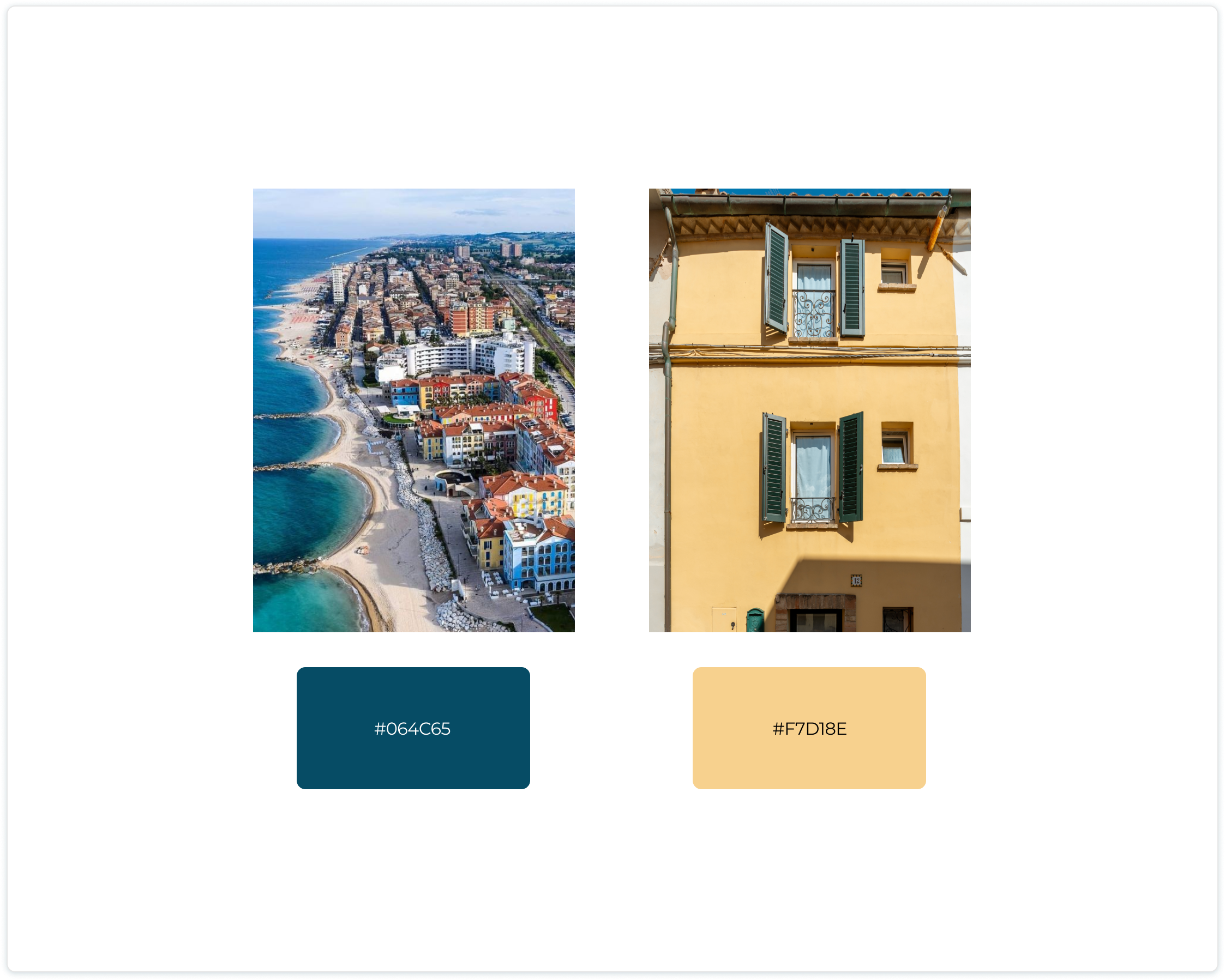
color extraction
Defining the palette through local context:
primary blue: Extracted from the sea to evoke freshness and calm.
accent yellow: Taken directly from the building's facade to bring warmth and architectural authenticity to the interface.
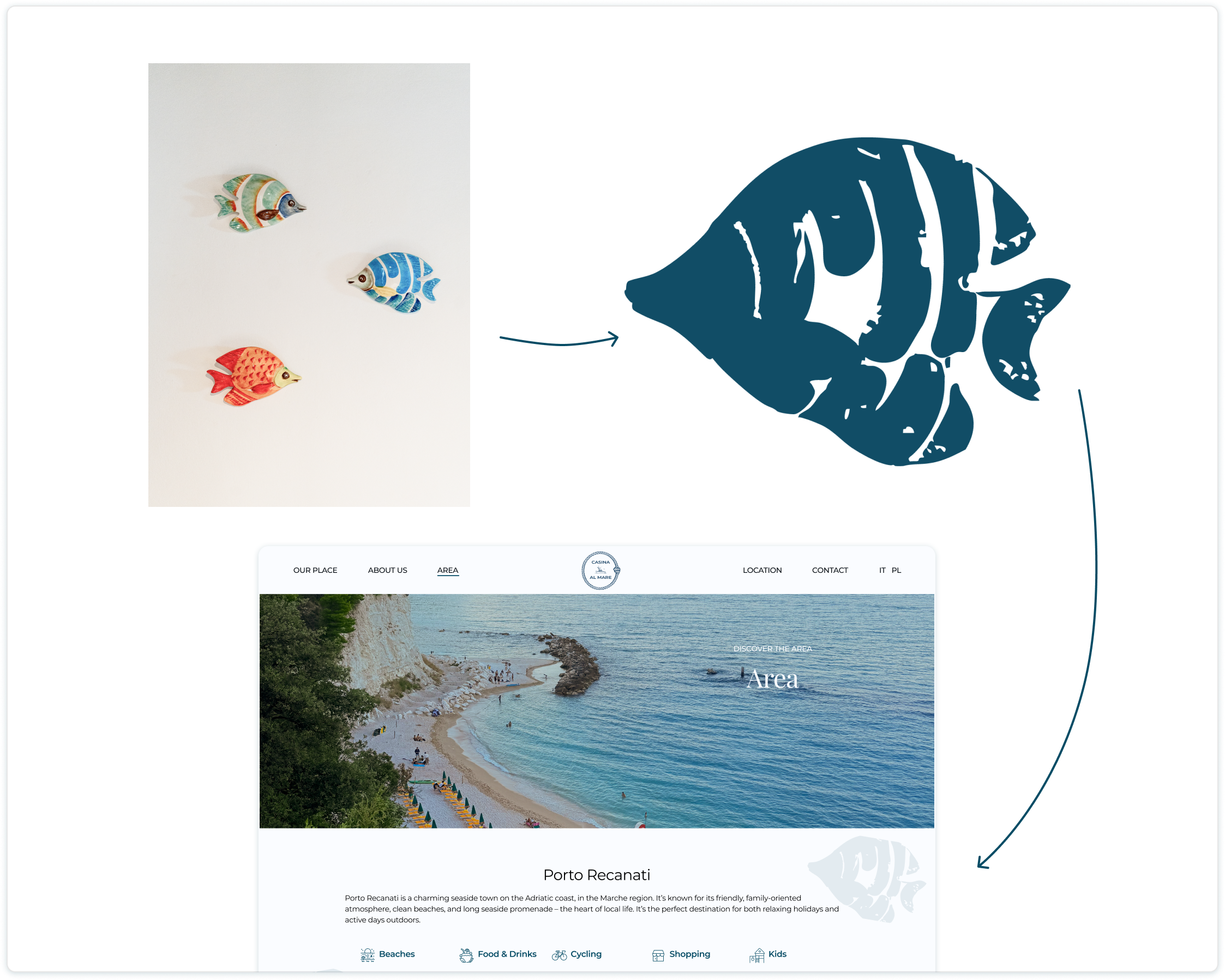
shape extraction
Beyond the core palette, subtle decorative elements were extracted directly from the interior design. A small detail of fish artwork, visible within the holiday home's decor, inspired a light, organic background texture, enhancing the coastal feel without distracting from the main content.
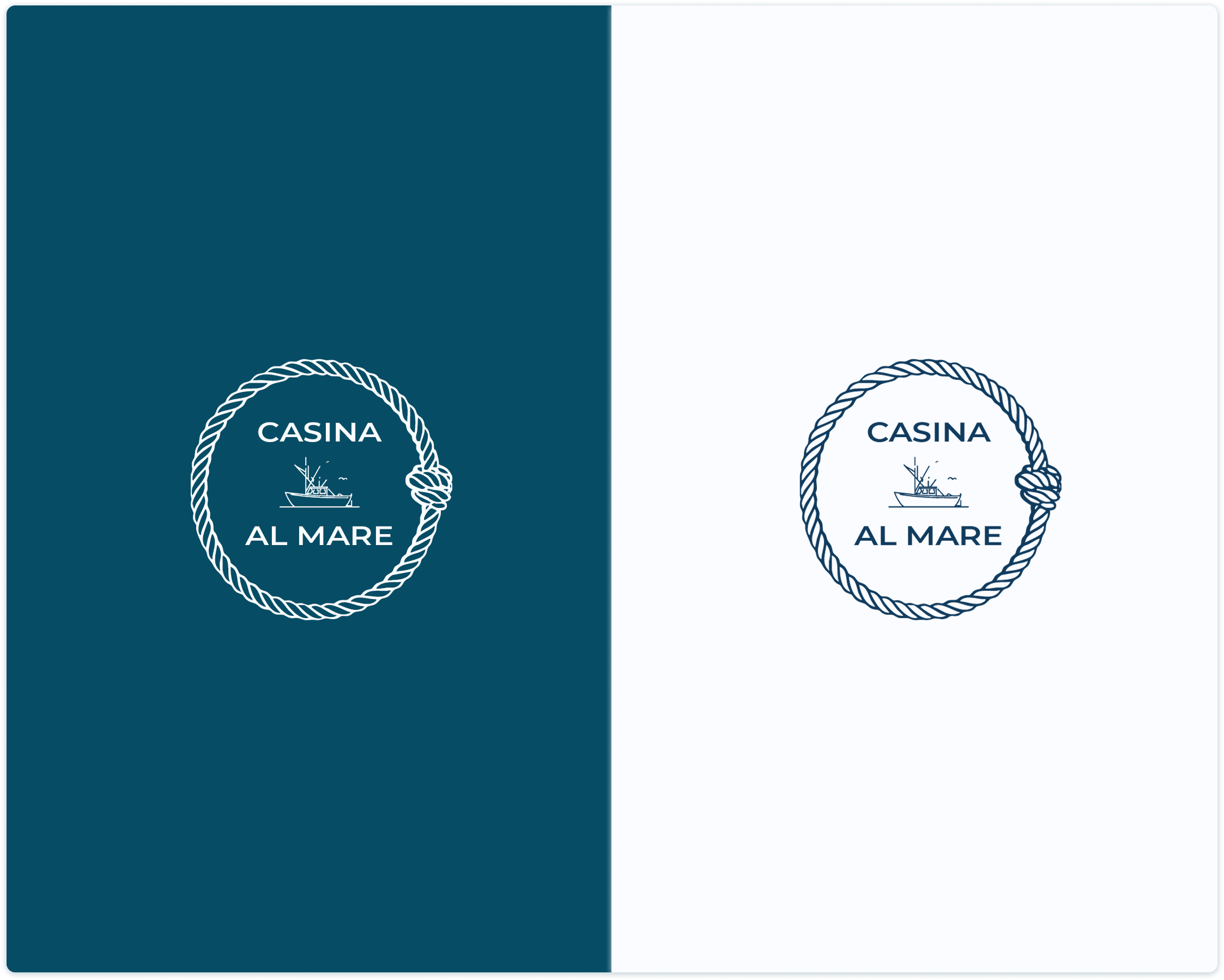
logo design: modern yet timeless
The logo for 'Casina al Mare' was designed to evoke a sense of modern elegance while honoring the building's heritage as historic fishermen's housing.
A clean, sans-serif typography (Montserrat) provides a strong, trustworthy foundation.
The deep navy blue color and the rope motif directly reference the maritime roots of the property, bridging its humble history with its new role as a premium, direct-booking destination.
addressing user needs through design
01 the primacy of location
The hero section immediately addresses the primary motivator with the headline 'just steps from the sea', while the mobile view prioritizes the map for on-the-go navigation.
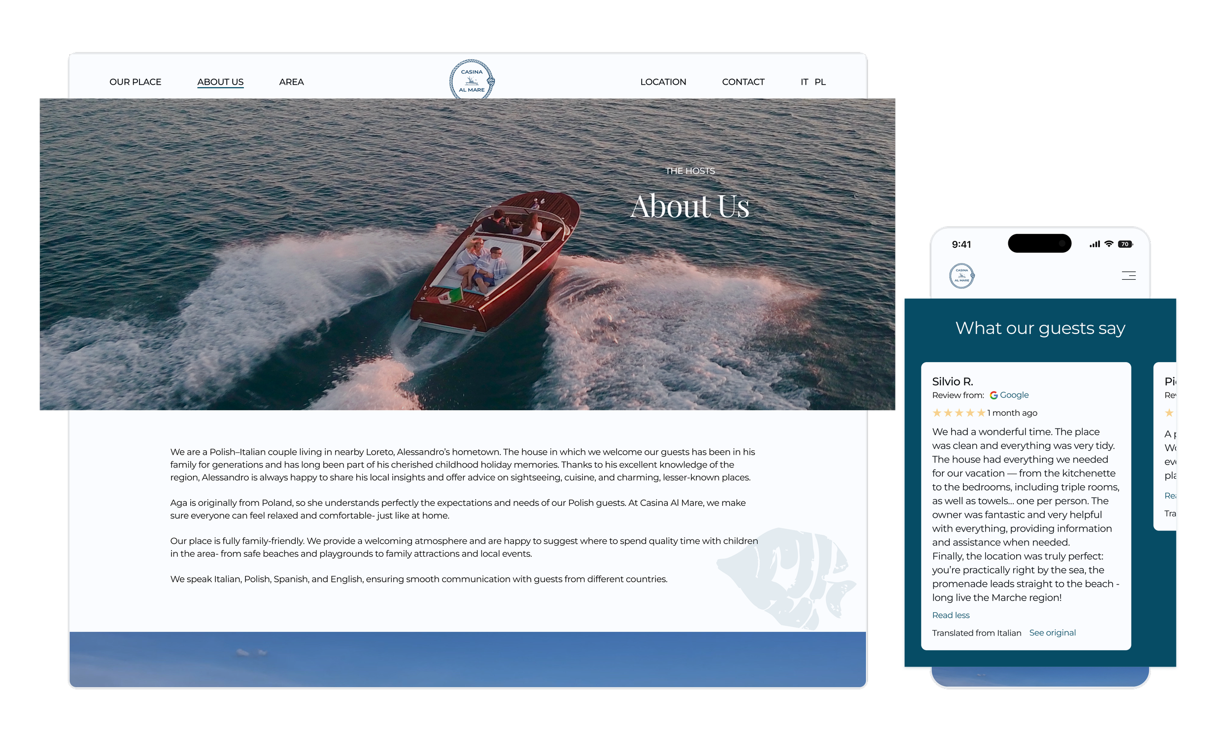
03 the host as a differentiator
Elevating the host's story and real guest reviews to build trust and leverage the personal connection as a key brand asset.
02 well-equipped & clean space
A clear, visual breakdown of amenities and property details replaces generic descriptions, instantly answering guests' functional questions.
the solution
design system & logic
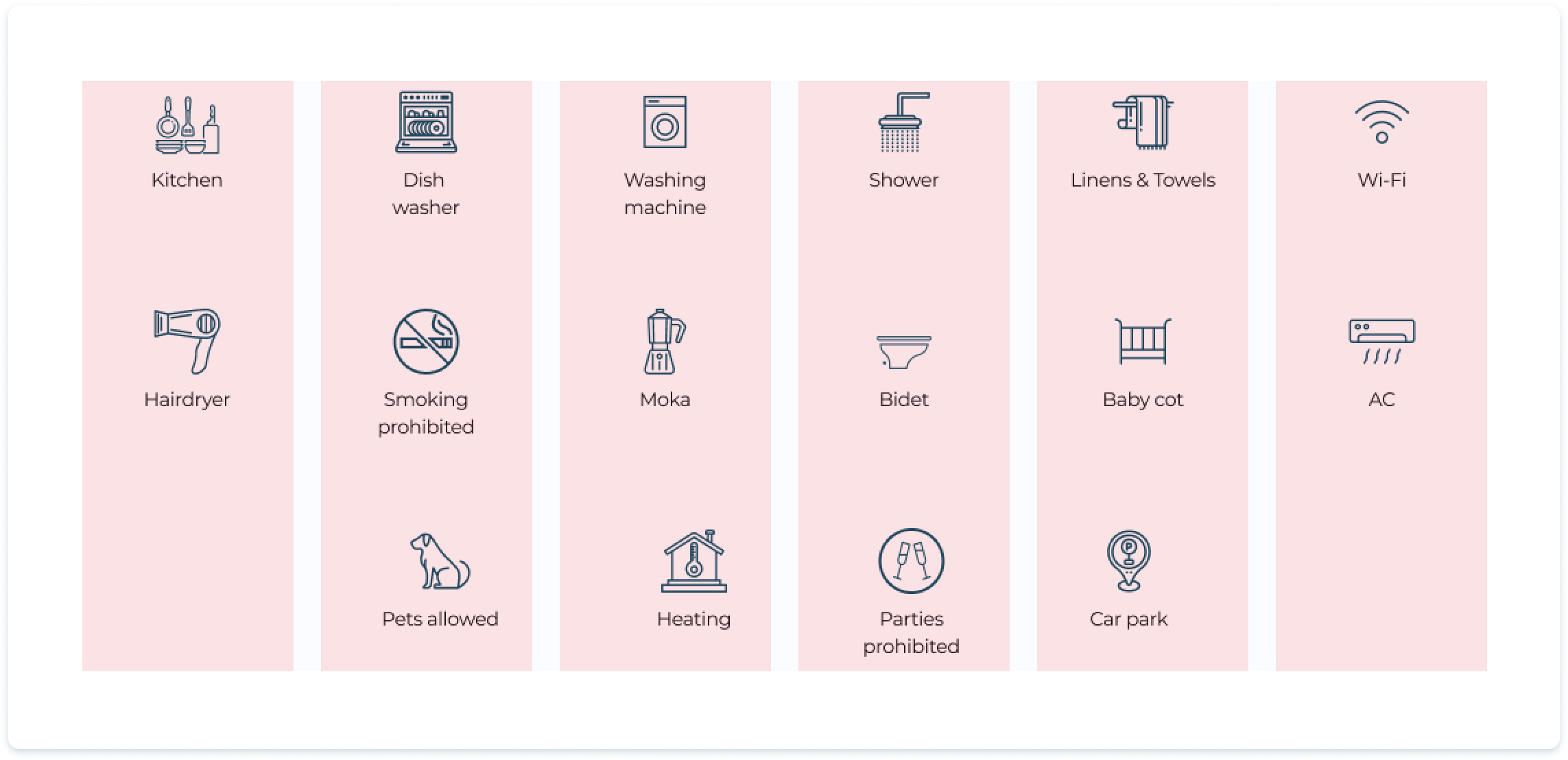
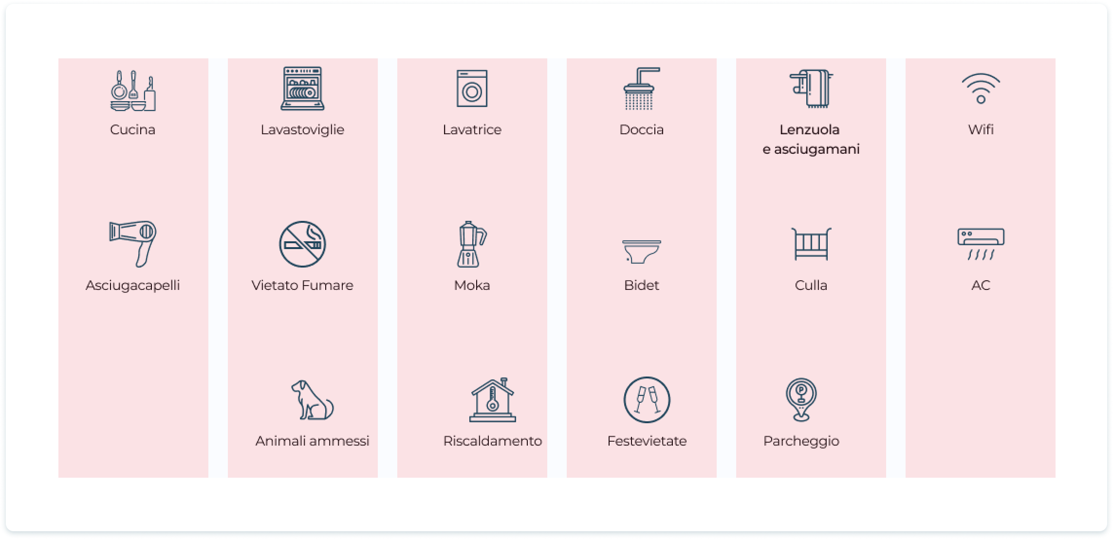
01 grid & localization
Building a flexible structure that adapts to both device size and variable text lengths across EN, IT, and PL.
english
italian
localization stress test:
Comparing component behavior across languages. The flexible grid allows item labels to expand vertically without breaking the alignment or visual rhythm.
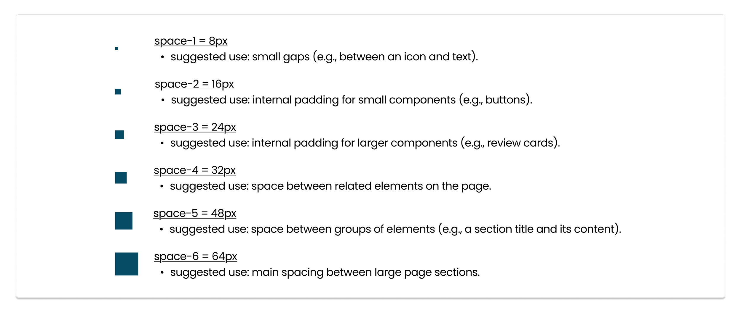
02 spacing system
To maintain visual harmony and reduce decision fatigue during development, I established a strict 8-point spacing system.
Instead of arbitrary values, every margin and padding is a multiple of 8 (8, 16, 24, 32...). This creates a predictable vertical rhythm where proximity clearly defines relationships between elements—closer items are related, while larger gaps (space-6) clearly separate semantic sections.
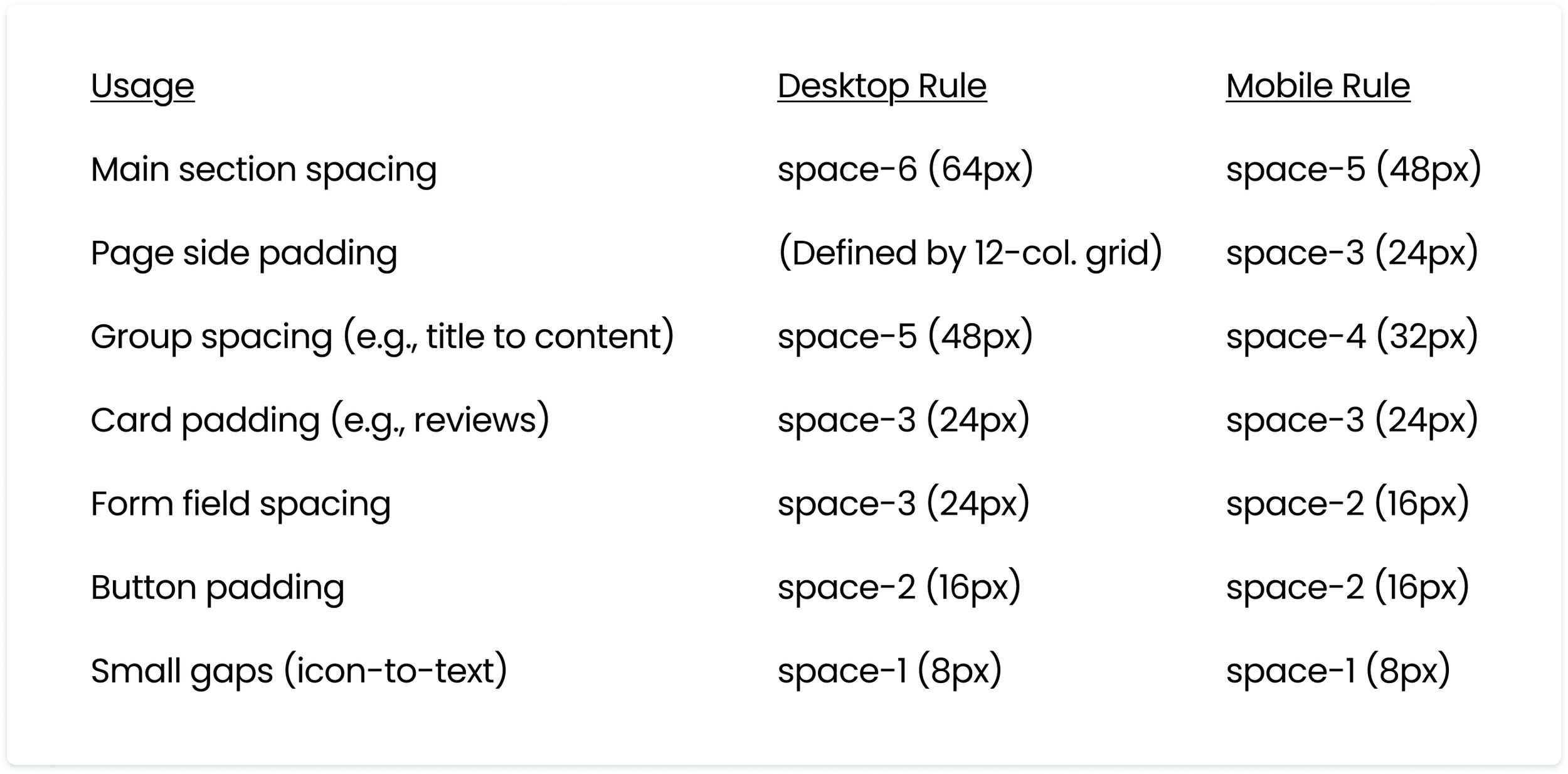
responsive logic:
On mobile devices, the system naturally tightens. Large section gaps (space-6 / 64px) automatically compress to the next step down (space-5 / 48px) to preserve valuable screen real estate without losing the feeling of openness.
the ui kit
To ensure consistency across all pages and facilitate a smooth handoff to developers, I consolidated all visual decisions into a centralized ui kit. This library serves as the single source of truth for typography, colors, and interactive components, ensuring the design remains scalable and easy to maintain.
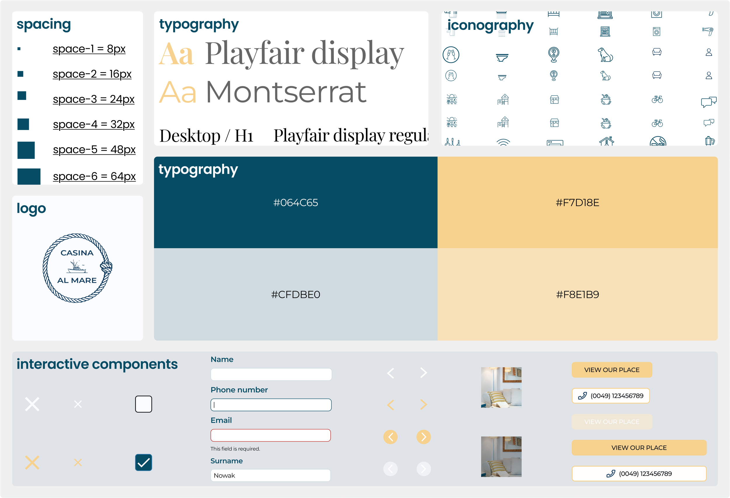
01 atomic structure: Components are built from foundational atoms (icons, type) to complex organisms (cards).
02 interactive states: Interactive elements cover a full range of states including default, pressed, disabled, and error to ensure clear user feedback.
03 accessibility ready: Colors and typography were selected to meet WCAG contrast standards.
04 responsive variants: Components are optimized for both Desktop and Mobile viewports.