

overview
Interest in homemade bread, especially post-pandemic, has surged among millennials. They value both tradition and authentic quality while enjoying the convenience of tech tools. Bread-making, however, involves timed steps that can be tricky to manage.
end-to-end application
my role
Product Designer, Research
duration
100H
tools
Figma, FigJam, Chat GPT, Zoom, Balsamiq, Exacalidraw
the goals
Provide clear, step-by-step guidance with timers and visuals to reduce confusion.
Offer accessible tips, explanations, and tools like a baker’s percentage calculator.
the problem
Home bakers, especially beginners, often feel overwhelmed by scattered and complex instructions. They struggle with managing dough resting times and find most materials for broadening their knowledge too complex and overwhelming.
the solution
introducing “Loafly”, a mobile app designed for home bakers that guides users through the entire bread-making process
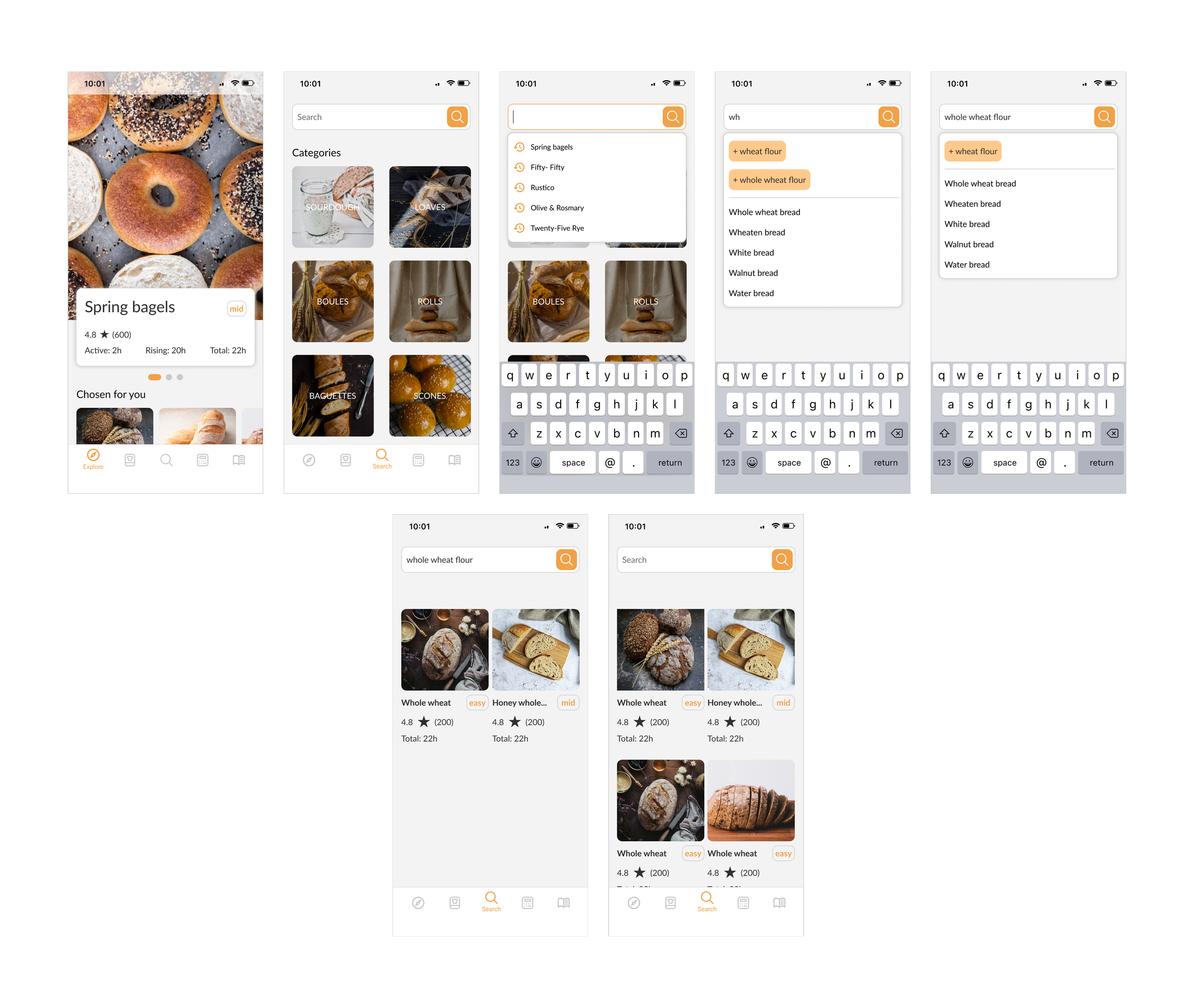
find the recipe that suits you best
Finding the right recipe can be challenging and time-consuming. In Loafly, users can search for recipes in two ways: by browsing through categories or by using the search bar. The search bar offers suggestions based on the first few letters typed, helping users quickly find relevant recipes.
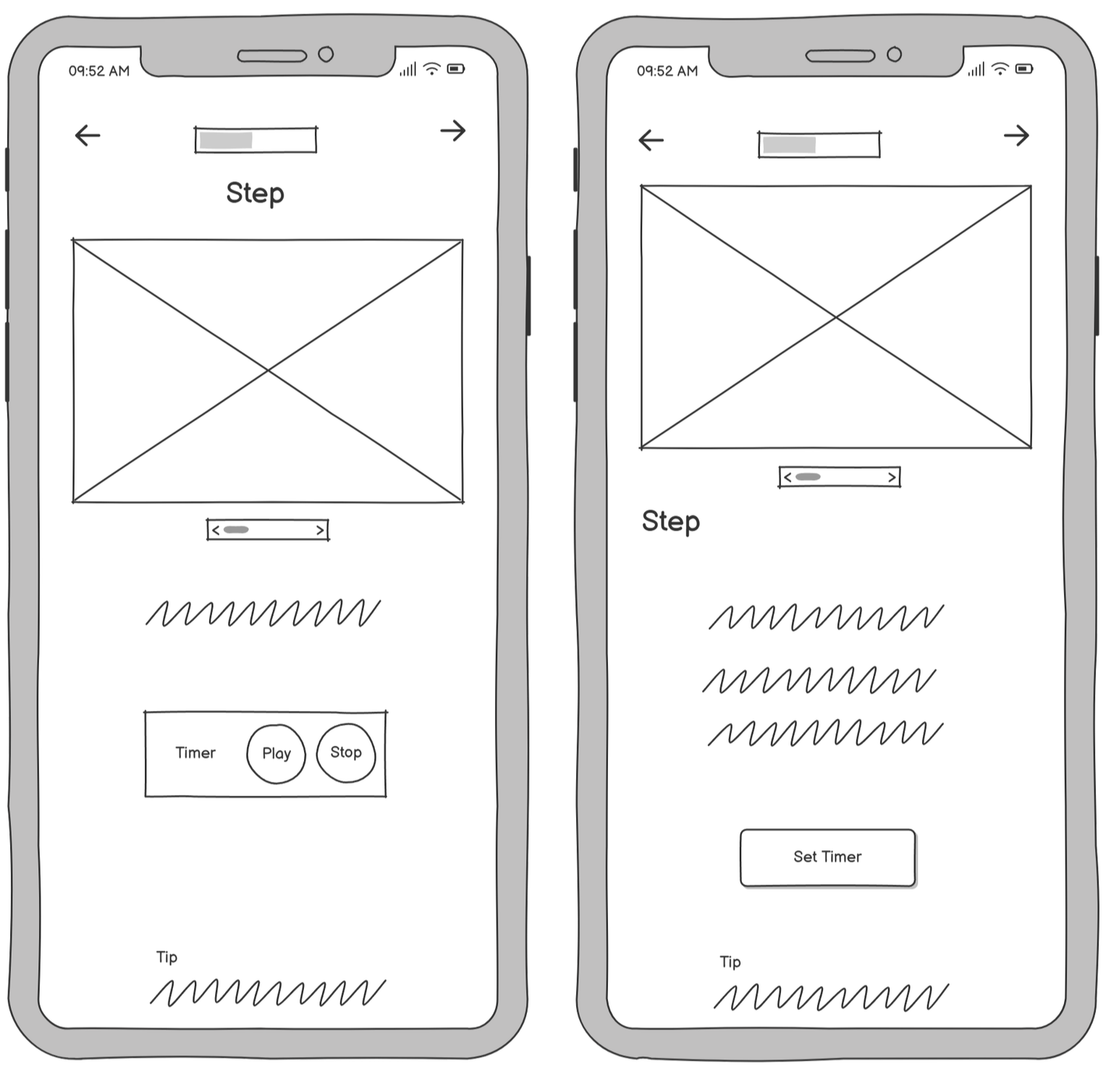
a clear and easy-to-use ‘baking mode’ for use during the baking process
Baking Mode breaks down each recipe into clear, manageable steps. Every step includes a photo, a timer, and a helpful tip to guide the user through the process. This makes it easy to follow along while baking, even with messy hands or limited time.
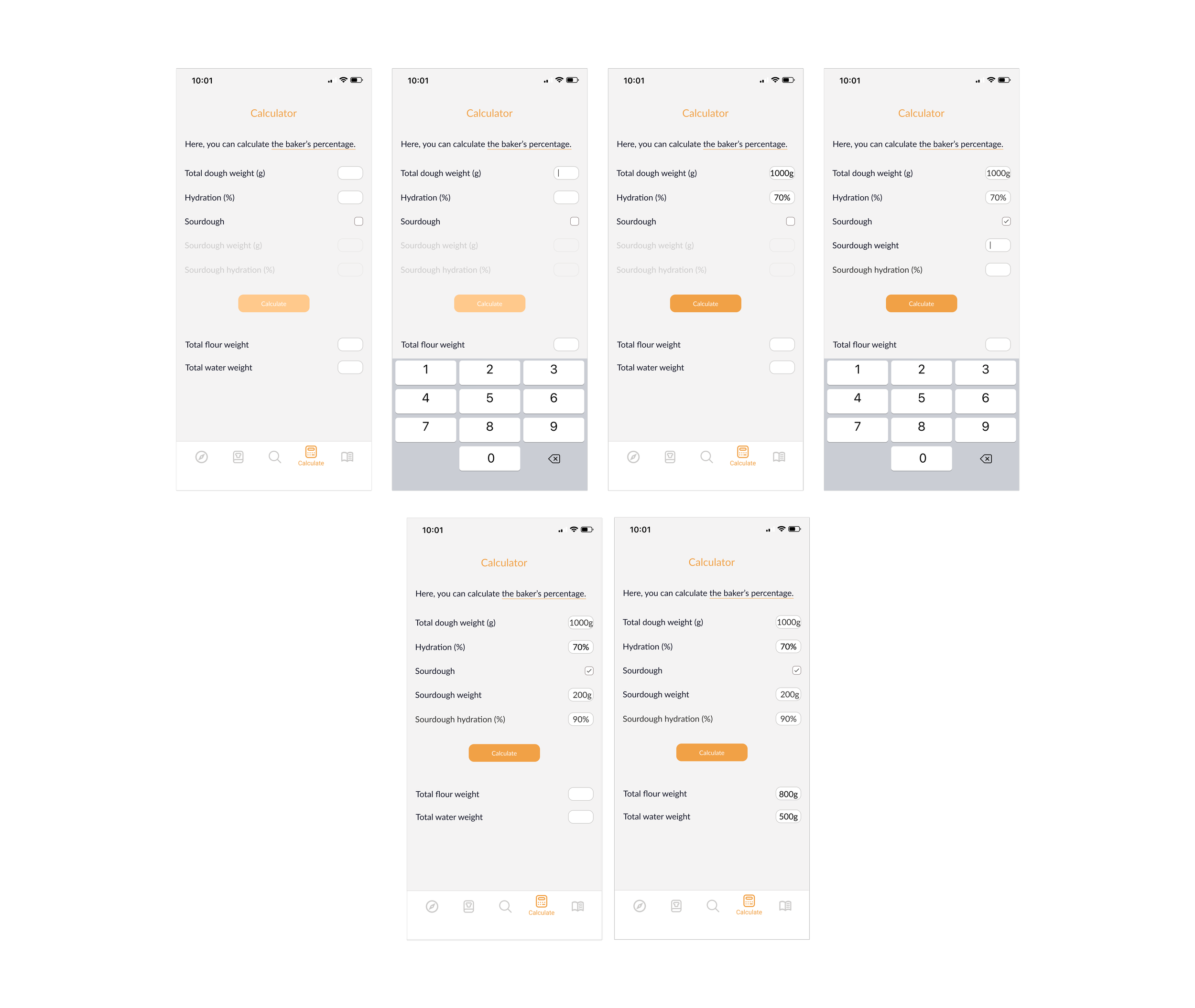
calculator for more advanced bakers
The app includes a calculator for working with baker’s percentages, designed for more advanced users who like to experiment with their own recipes. It helps calculate the exact amount of flour, water, and other ingredients based on the desired dough weight.
Let’s see how I got to the solution

research
comaprative analysis
the insights
01 overcomplicated for Beginners
– Many features and instructions are overwhelming or unclear for novice bakers.
– There's often a lack of onboarding or simplified baking guidance.
02 too much text, not enough visuals
– Instructions are text-heavy, making it hard to follow while baking.
– Missing step-by-step visuals or images to guide users through the process.
03 lack of integrated tools
– No or poor integration of helpful tools like timers, baker’s percentage calculators, or timeline planners.
– Users have to switch to other apps or do manual calculations.
04 poor personalization & search experience
– Search functions are limited and not intuitive (e.g., no smart suggestions, filters by flour type, or image-based search).
04 no learning support
– No clear way to learn more about baking techniques or ingredients within the app.
– Lacking beginner-friendly explanations or educational content linked directly to recipes.
gluten morgen
An app for all home baking enthusiasts. It simplifies ingredient calculations and helps create custom recipes for perfect bread.

kneady
It is the a home-baking app, made for bakers of all levels with recipes from professional bakers.

rise
It is devoted to every apsect of baking bread. It includes recipes, makes planning & scheduling .
user interviews
getting inside the user's perspective
Key objectives
01 Identify the biggest challenges home bakers face when making bread
02 Understand how beginners and experienced bakers approach the bread-making process.
03 Explore what tools or methods home bakers currently use to track recipes and baking steps and how they improve their baking skills
04 Identify the key features users would find most valuable in a bread-baking app
key insights from interviews
100%
Use Multiple, Uncentralized Sources
All interviewees mentioned using scattered sources like YouTube, books, or friends—none relied on one centralized app or platform.
80%
Bake for Control & Enjoyment
Most interviewees started baking to control ingredients, avoid store-bought bread, and enjoy the satisfaction of homemade baking
60%
Struggle with Time & Scheduling
The majority mentioned missing steps, difficulty fitting baking into their routines, or trying to align baking with cheaper electricity hours.
define
user persona
Based on all the insights gathered from the interviews, I created a user persona — a home bread baker and hobbyist. The user is not a complete beginner and already has some baking experience. However, certain steps are still challenging, and he struggles with planning his time to fit this hobby into his daily routine.

Tom
goals
Better control of the time between individual tasks.
Not have to spend too much time searching for the right recipe.
Learn something interesting while baking.
pain points
He’s eager to learn but recipes only contain instructions without any additional interesting facts.
Forgetting to perform the next task, which leads to consequences in later stages of baking.
Feeling overwhelmed by the multitude of recipes online and the need to calculate proportions for his individual needs.
needs
Tom needs a clear, structured baking process with reminders, easy-to-follow recipes, and simple explanations that fit into his daily routine and support learning without extra effort.
understanding the user’s experience step by step
The customer journey map helped me visualize the process a home bread baker goes through, clearly highlighting the moments of irritation and frustration—especially when searching for the right recipe and trying to follow each step while keeping to the correct timing. It also shows what brings them joy—learning interesting facts along the way and achieving a successful, fresh bake at the end.

“how might we make bread-baking knowledge more accessible and less overwhelming for everyone?”
brainstorming
Based on the How Might We...? question I created, I conducted a brainstorming session with ideas for features in the app.
01 progressive learning layers: show basic info first, with the option to "dig deeper" for those who want it.
02 visual-first recipe guides: using photos, videos.
03 baking mode: timed walkthroughs, so beginners never feel lost.
04 "predict my proof" tool: log ambient temp and starter behavior, and get fermentation estimates.
03 timeline: to see the steps in order, each with its assigned time.
06 calculator: hydration, flour, etc.
07 timers for each step: bulk ferment, folds, proof, etc.
08 recipe search
I designed features for effortless baking—find recipes fast, check if they fit your schedule, and follow clear steps. Even long breaks are covered with background timers via local notifications.
04 "predict my proof" tool: log ambient temp and starter behavior, and get fermentation estimates.
a tip from a developer: designing timers that actually work
I learned timers may stop when apps close—reminding me to design with technical limits in mind.
background tasks are tricky: Timers can pause when an app is minimized. We used notifications to maintain accurate timing.
local notifications were key: We used them to remind users of baking steps, ensuring they were nudged even if they left the app.
user control is essential: We added options to pause, reset, and edit timers for a more flexible UX.
ideate
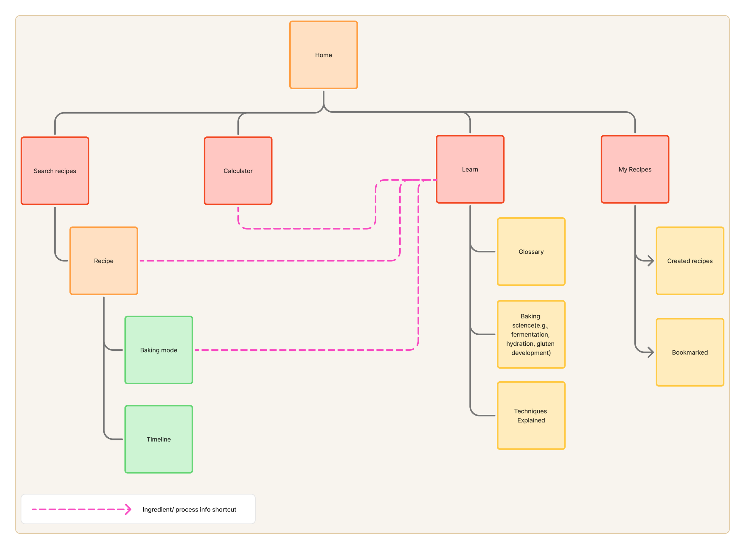
sietemap- structural breakdown
The sitemap outlines a clear structure: browse recipes, use a calculator, manage bakes, and access learning content. Contextual shortcuts, like jumping to Learn from Baking Mode, support just-in-time help.
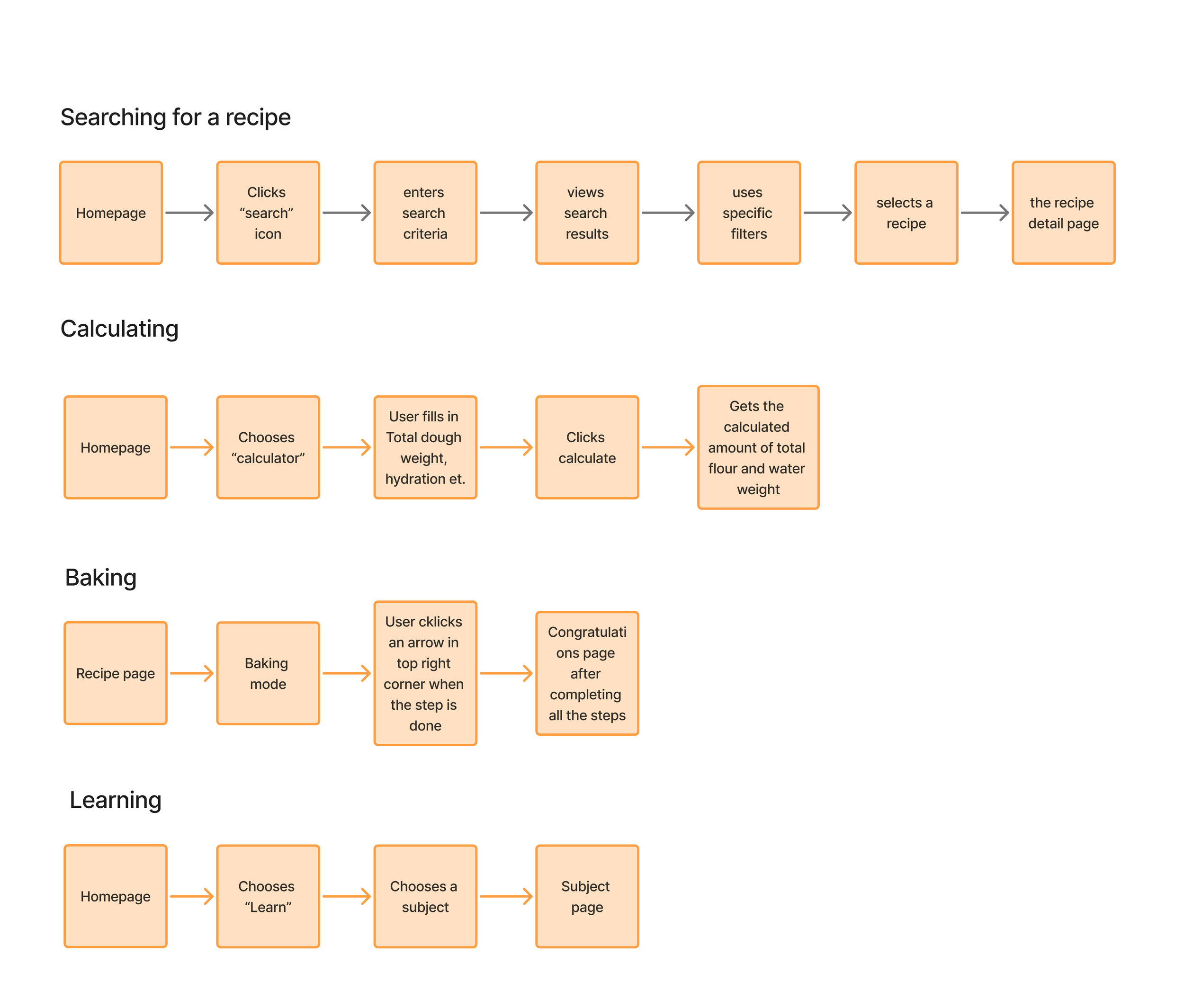
user flow & task flow overview
Research revealed the calculator should be a standalone tool, not part of the recipe flow.

a tip from a developer: why “edit recipe” isn’t so simple
Recipe editing can strain older devices (limited cache) and slow connections (multiple database requests).
translating concepts into screens
I visualized the gathered research insights and concepts in the first version of low-fidelity wireframes.

landing page
version 1 won.
feedback: Users often don’t open the app with a specific type of bread in mind. Highlighting suggested recipes with large, inviting photos on the home screen helps draw them in.
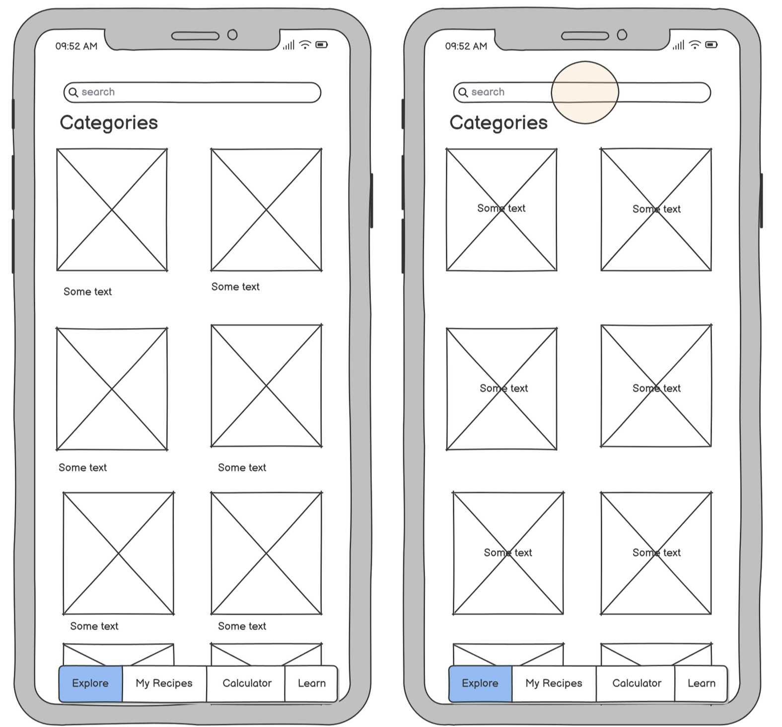
categories
version 2 won.
feedback: There’s no need to take up space with a category description below the image.
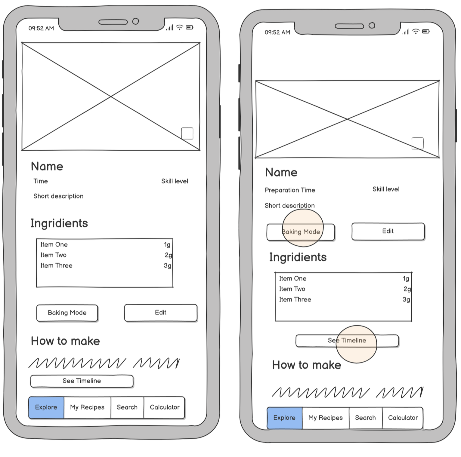
recipe page
ver 2 won.
feedback: In Version 1, if the ingredients list is long, users would have to scroll to reach the buttons.
baking mode
ver 2 won.
feedback: The name of the step appears directly above the instruction.
design
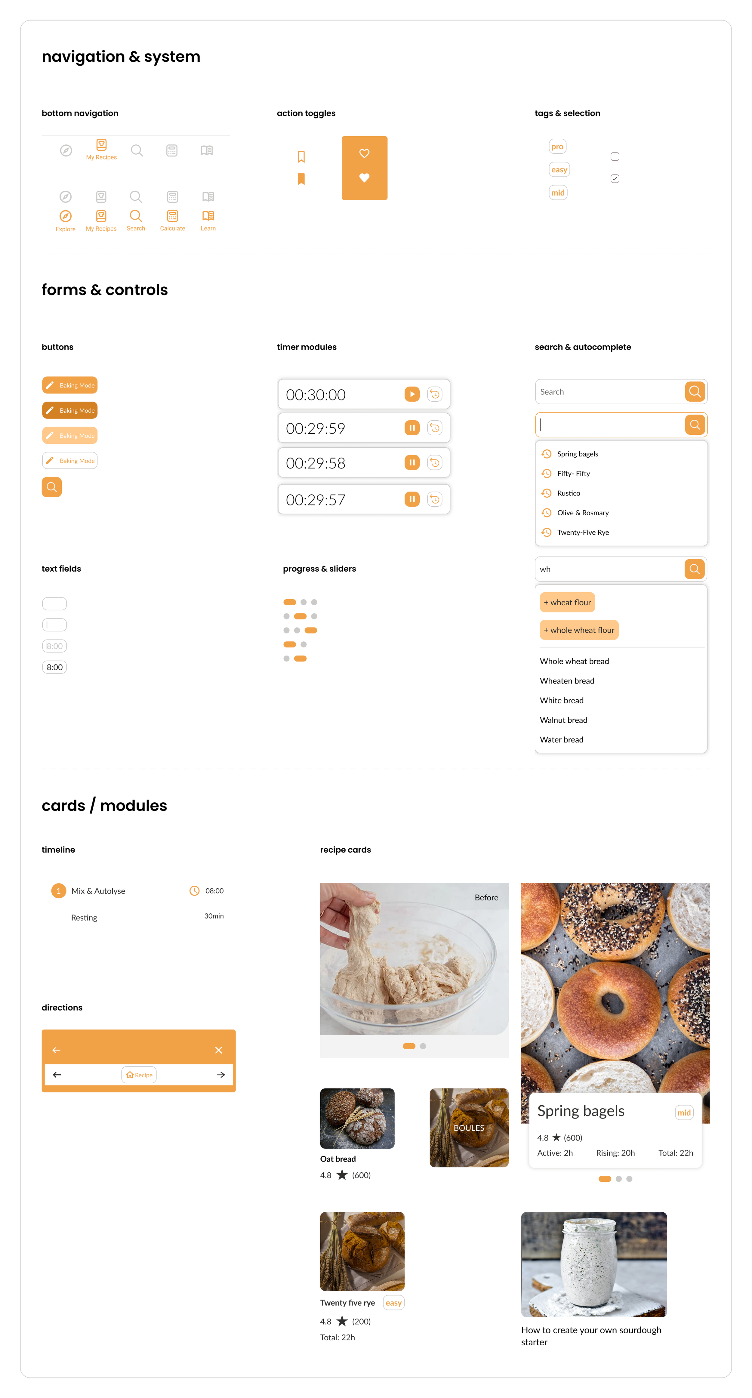
style guide
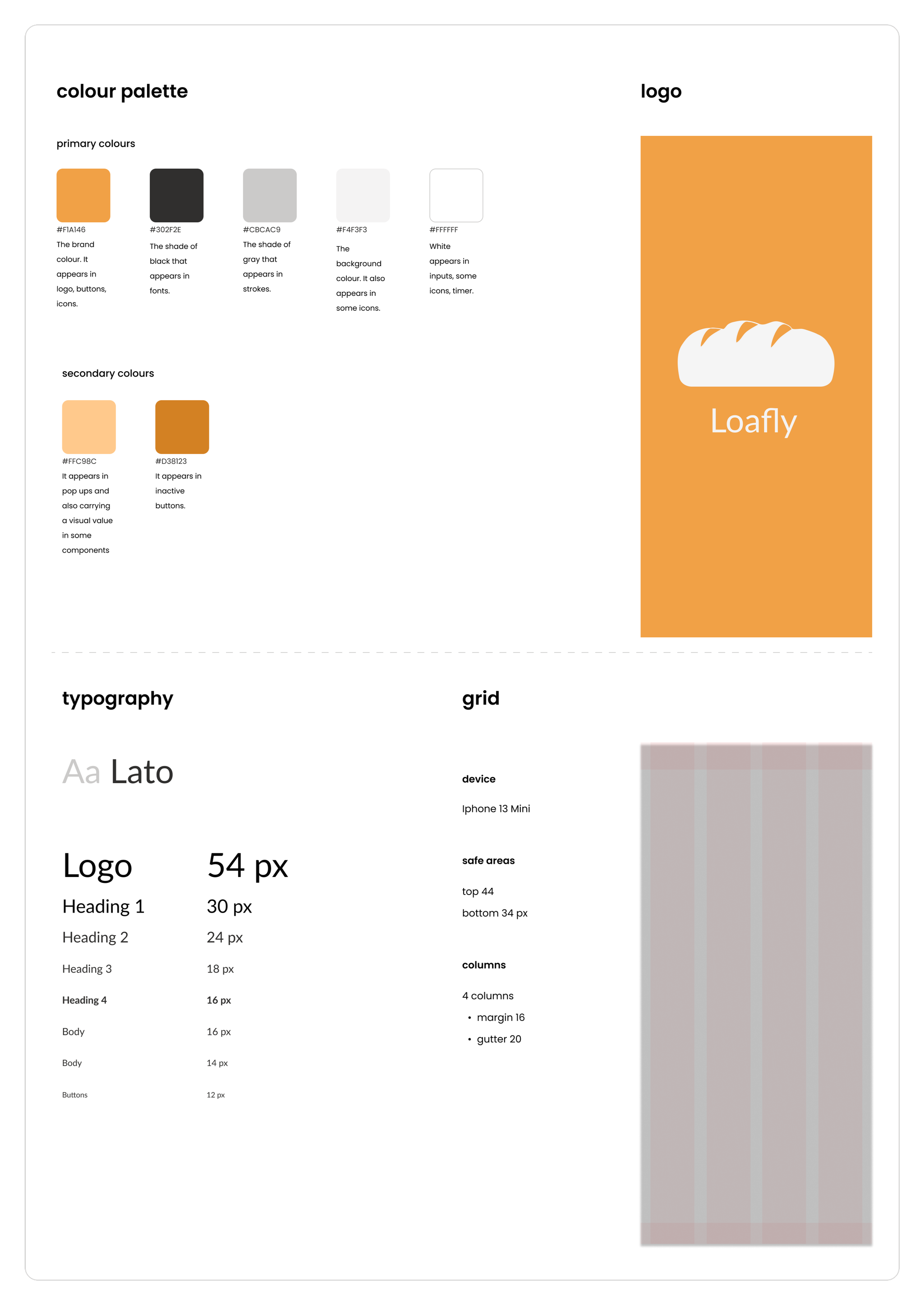
ui design
This UI kit defines the visual identity and interface components for the Loafly app.
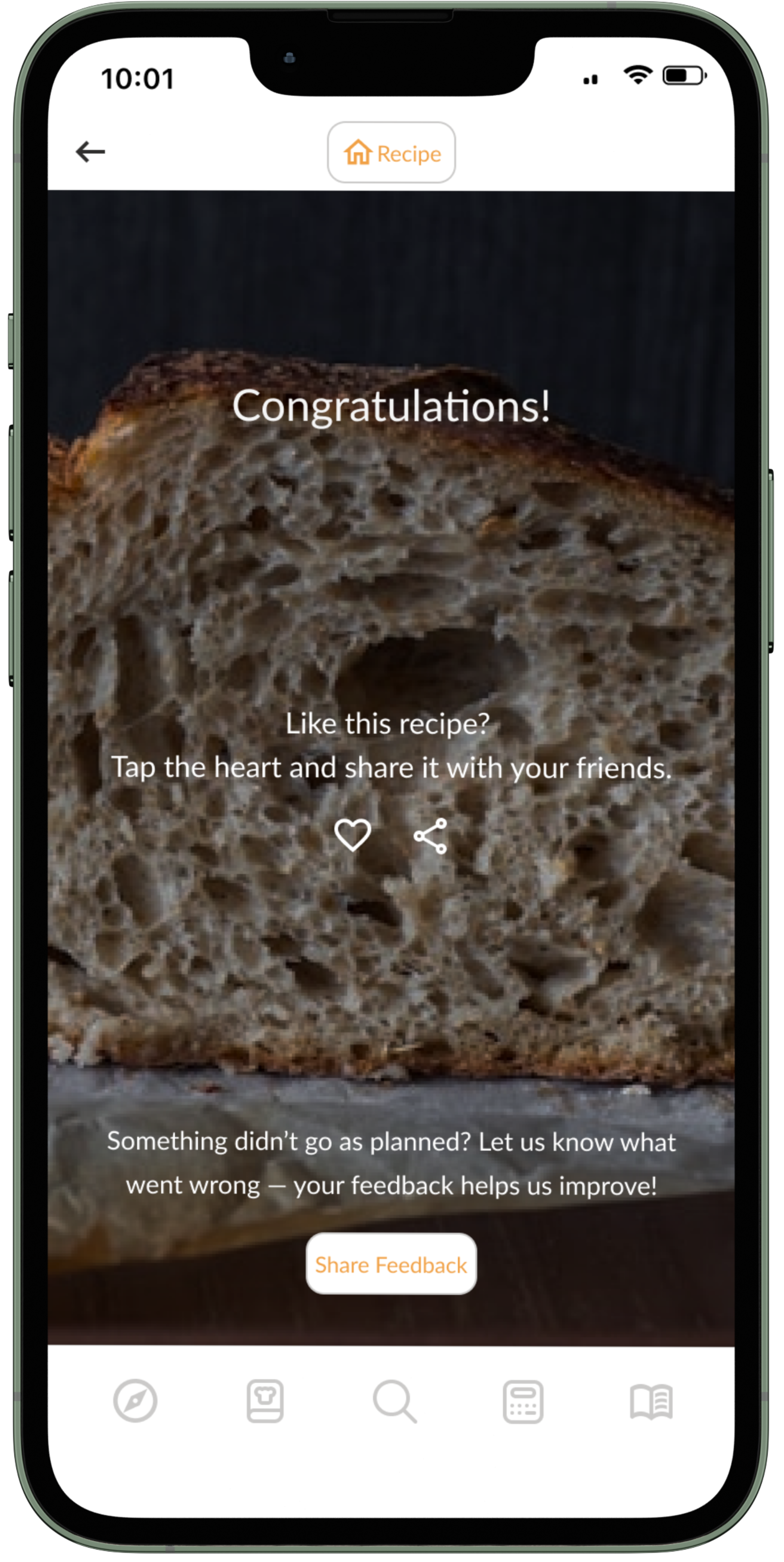
measuring an impact
The last wireframe completing the baking mode is the congratulations screen for baking the bread. The user can add a heart if they liked the recipe or submit feedback if something went wrong.
final design
Loafly is a comprehensive mobile application designed for home bread bakers, aiming to simplify the entire bread-making process from recipe discovery to final bake. It empowers users to easily find suitable recipes and seamlessly integrate baking into their daily schedules.
core features
Intuitive Recipe Discovery & Diverse Catalog
Advanced & Flexible Search Functionality
Guided Step-by-Step Baking Mode
Integrated Timelines for Efficient Planning
Smart Recipe Calculator for Customization
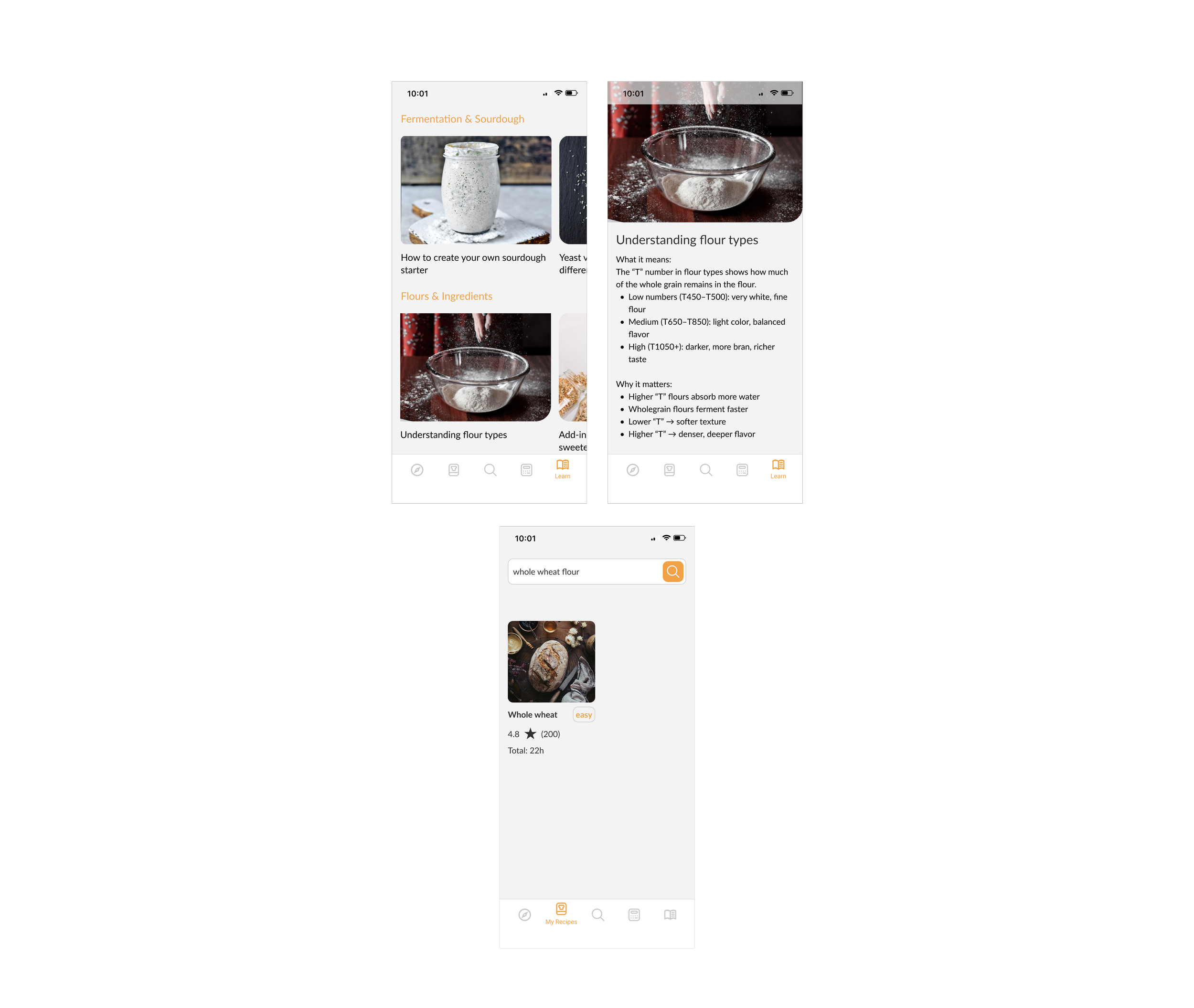
Accessible Educational Resources
searching for a recipe
recipe & timeline
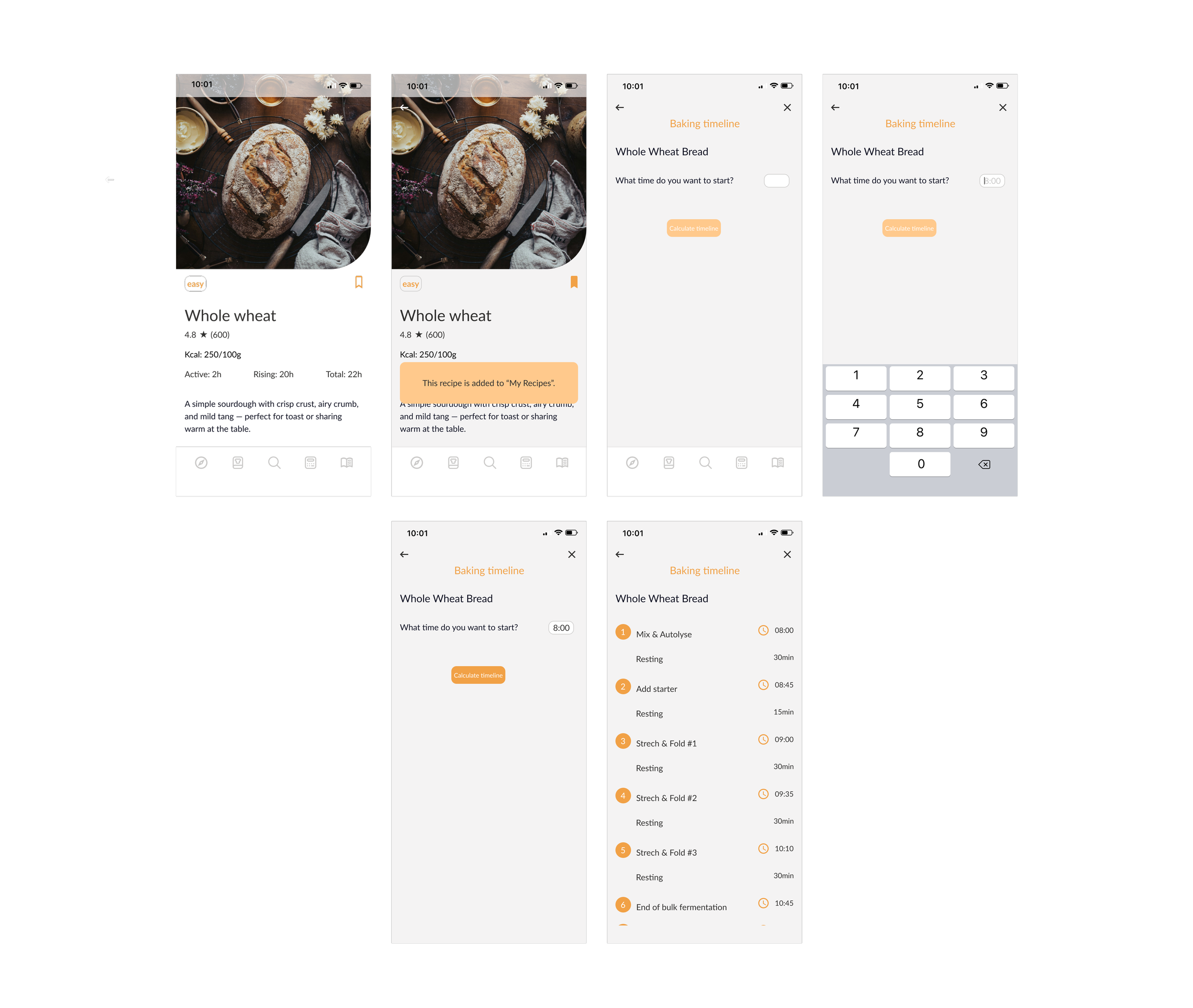
baking mode

learn & my recipes
calculator
why loafly is unique?
01 time as a design system
Loafly treats time not just as data, but as an integral part of the UI:
Custom baking timelines auto-generate based on the recipe.
Timers are deeply integrated, with local notifications and real-time step tracking.
Users don’t just read recipes — they move through time with them.
02 baker's mindset, not just instructions
Most apps tell you what to do — Loafly teaches you why and how:
Technical terms (like “autolyse” or “stretch & fold”) are interactive and link to bite-sized educational content.
It’s not just an app; it’s a learning experience that grows with the user.
03 minimalist, moment-based interface
Loafly focuses the user on the current step only — reducing overwhelm and distractions:
No endless scrolling through recipes.
No cluttered screens full of measurements and ads.
Every design choice respects the pace and mindset of slow, mindful baking.
takeaways
The Loafly project marked my first comprehensive experience in designing an end-to-end application. It was an incredibly valuable learning journey that encompassed all key stages: from in-depth research and conducting user interviews, through usability testing, to the final high-fidelity wireframes.
A crucial element of this process was the continuous collaboration with a developer. Consultations at every stage of the project provided me with invaluable insight into the technical aspects of implementation. Furthermore, the fact that the developer is also a passionate bread baker enriched the project with a unique user perspective, allowing for the creation of solutions even better tailored to real-world needs.
what i liked the most
I enjoyed delving into a topic I had to educate myself on, such as all the bread-baking processes and the calculator, which made the user interviews truly interesting as they walked me through the entire process. Consulting with the developer at every stage of the project further enriched my understanding of the technical side, for instance, regarding local notifications to ensure the app's timer ran in the background while using the phone. And I can't help but mention that throughout the entire project, I was accompanied by the scent of freshly baked bread, which I could almost smell while browsing all those delicious-looking photos of baked goods.
next steps
01 personal notes per recipe
02 next tests
03 gamification: baking achievements