
how do you redesign a national train schedule website used by millions—while enhancing the user journey?
here’s my approach
overview
rozklad-pkp.pl, Poland’s official train schedule site, is widely used but suffers from outdated design and poor usability. This redesign modernizes the interface, improves usability, and enhances accessibility while preserving essential features.
my role
UX/UI designer research
duration
50h+ hours
tools
figma, chat GPT
challenge
The main challenge was to modernize rozklad-pkp.pl and improve usability.
Key issues included:
Poor adaptation to modern screens
Lack of clarity when redirected to ticket sites
Hidden features like delay tracking
Inconsistent mobile experience
Outdated visual design
goals
01 Simplify navigation and search
02 Refresh layout and visual style
03 Ensure a consistent experience across all platforms
04 Highlight valuable features
solution
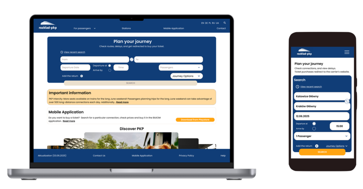
The redesigned pkp-rozklad.pl website features:
01 Clear information about redirection to carrier websites for ticket purchases
02 Easy connection search

03 The site now displays the minimum ticket price

research
exploring the current rozklad-pkp.pl website
The desktop version appears to have been designed with smaller or outdated screen resolutions in mind.

01 lack of language consistency – despite setting the interface to English, a key stop like the airport is still shown in Polish. Also, the “Important Information” section appears in Polish.
02 overwhelming number of ads – visual clutter negatively impacts the user experience.
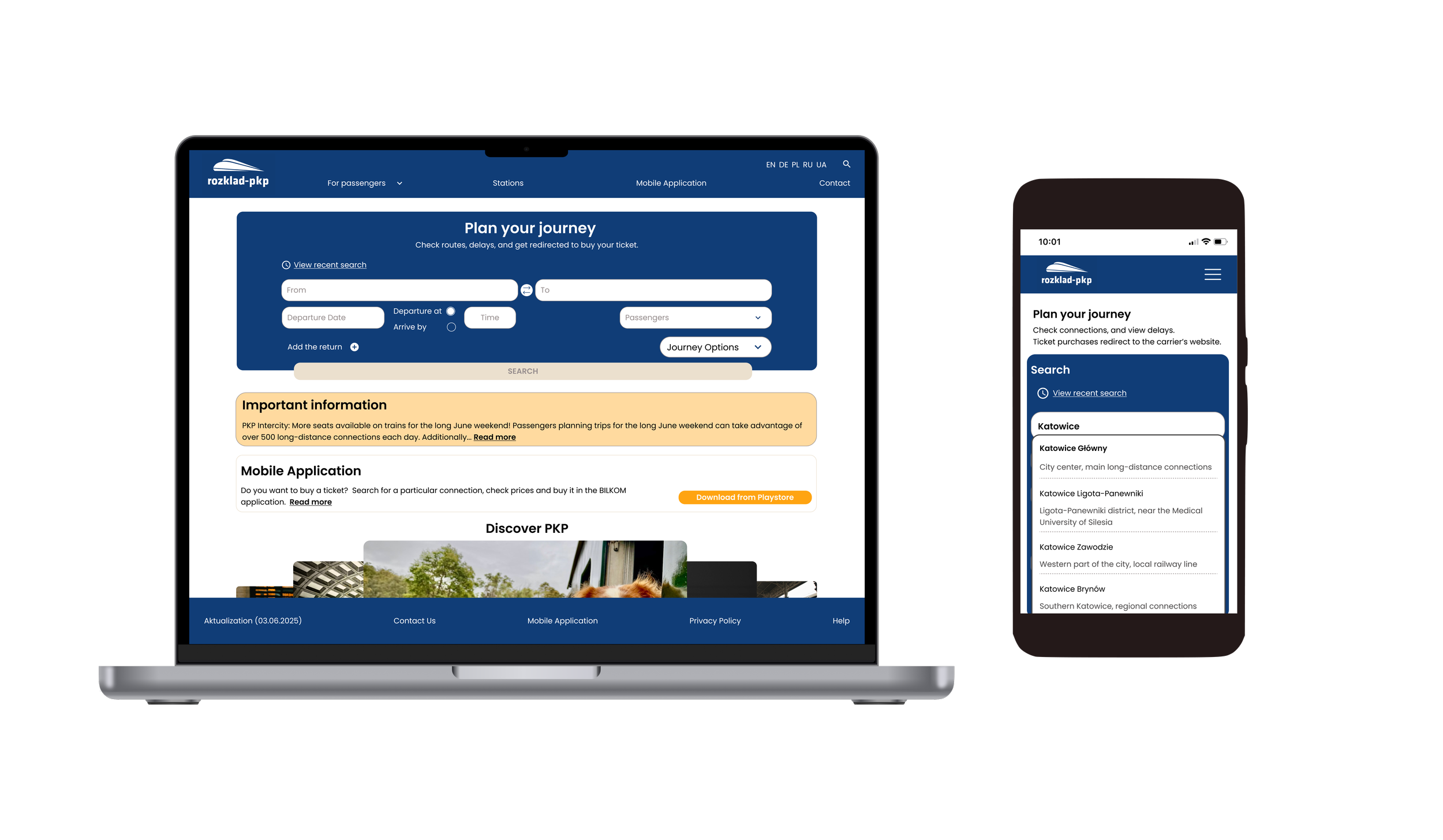
03 search issues – no suggestions appear while typing, there’s no clear indication of the main (central) station, and the label “WARSZAWA-” in mobile results is confusing and unclear.

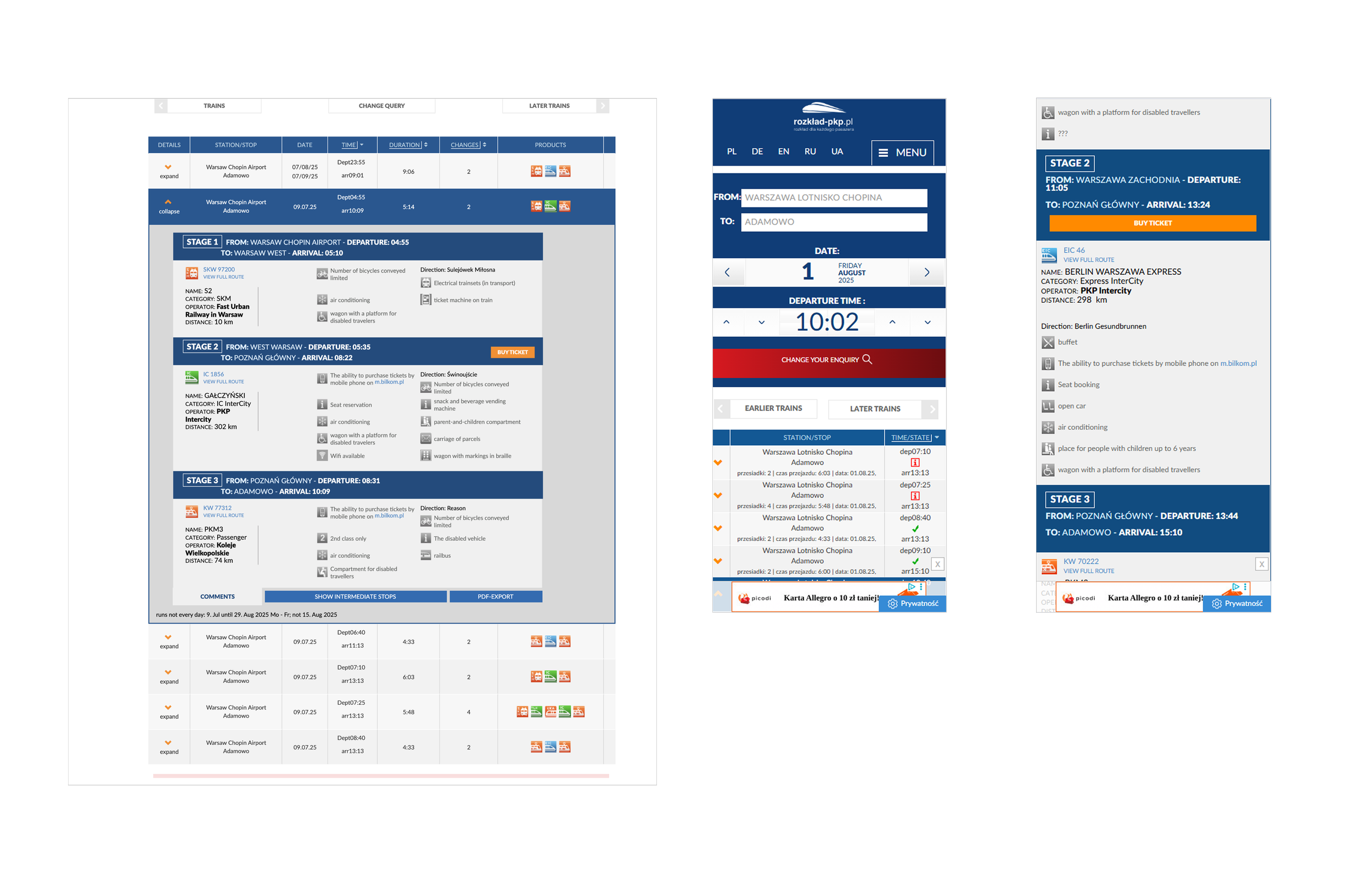
01 inconsistent stop naming – in a three-leg trip example, station names vary in format. Additionally, the “buy ticket” button appears only for the full trip, not for individual segments.
02 mobile ui issue – in the mobile version, the stations entered by the user are displayed in grey text, which gives the impression that the fields are empty or still require input.
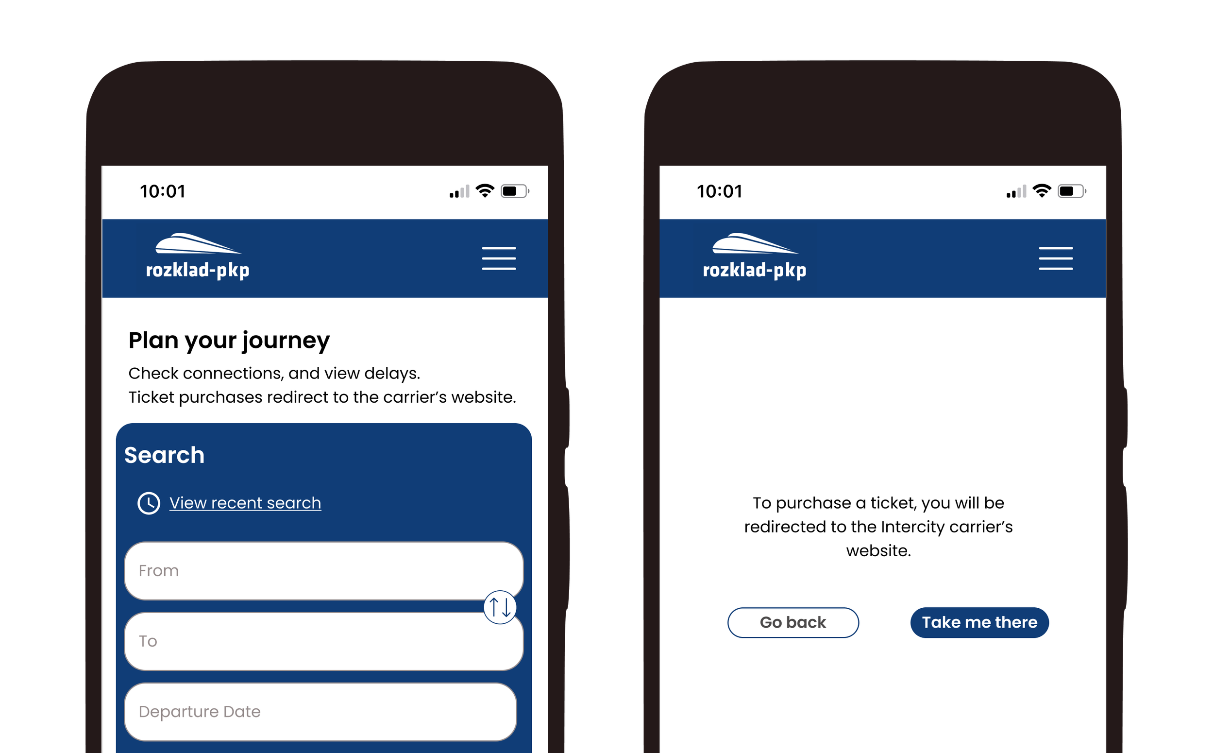
The user is redirected to a different website without any prior warning or clear indication.
Searching for a train on the original rozklad-pkp.pl website
competitor analysis


research goals & objectives
I want to understand the most frustrating or challenging moments in users’ journey so I can design solutions that directly address those pain points.
01 Identify Primary User Groups
02 Understand User Goals and Pain Points Across the Booking Journey
03 Understand user expectations for mobile train booking and the reasons behind mobile search behavior
details:
6 interviewed
Age: 30-35
Different reasons and frequency for choosing trains as a means of transport
key takeaways from user interviews
01 clear priorities
Users expect to see available seats early, and they value fast booking, transparent pricing, and a visual seat selector.
02 booking frustrations
Key problems include a lack of seat information, unclear train layouts, search flow errors, and app crashes.
03 mobile over desktop
Most users avoid downloading apps. BLIK payment convenience makes mobile web their preferred choice.
04 desired extras
Users value Wi-Fi, real-time delay info, a multilingual UI, and a consistent experience across all devices.
05 user segments
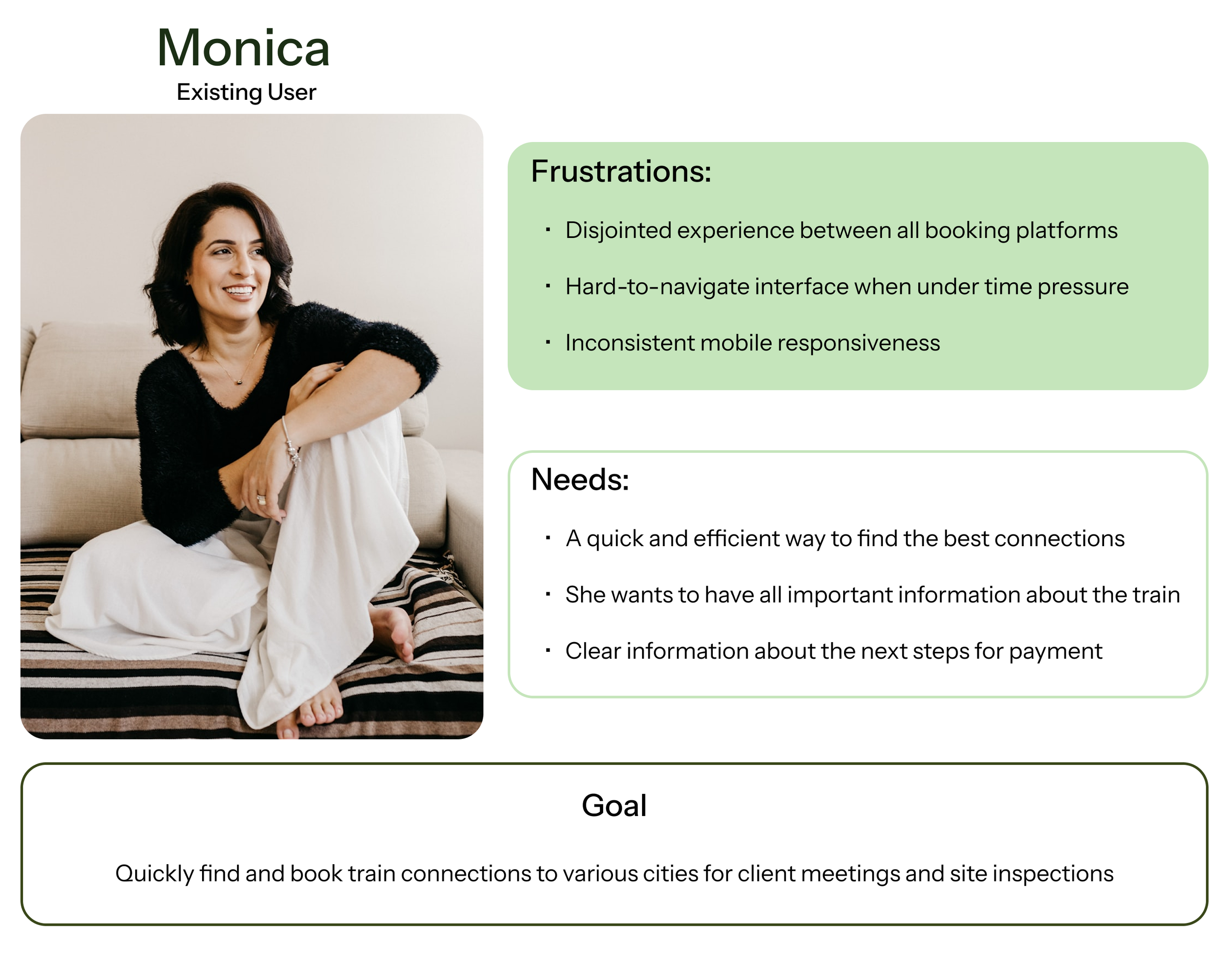
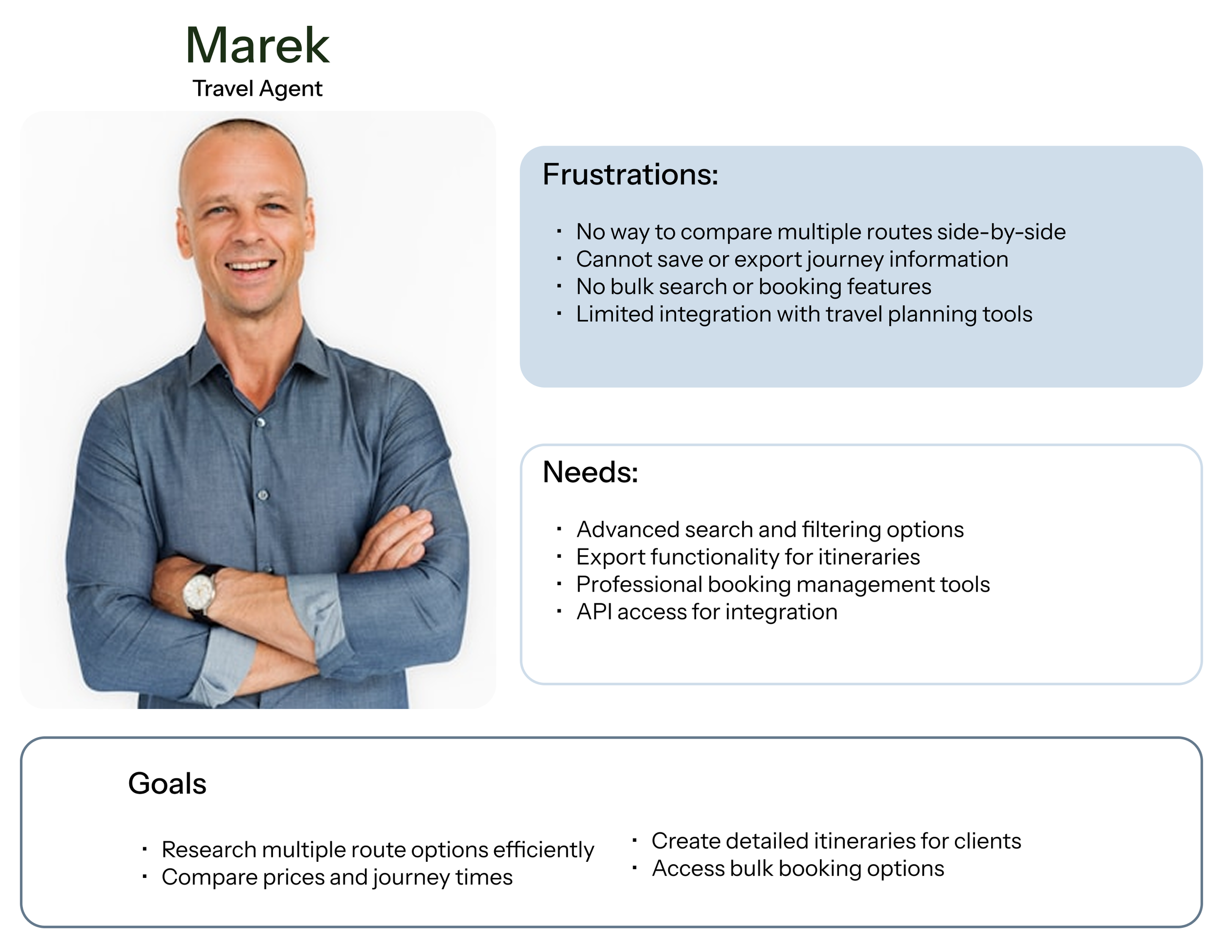
Research identified 3 key user segments: "existing user," "new to the city," and "travel agent."
🚧 obstacle for my project
Unfortunately, rozklad-pkp.pl redirects users to external carrier websites for ticket purchases, which means that seat selection is not available within the main booking flow. This option becomes accessible only after being redirected.
define
user persona
Based on insights gathered during interviews, I was able to identify three distinct user groups: existing User, new user to the city, and travel agent. In my project, I focused on the first two groups, as travel agents have different needs and, as professionals, typically do not use mobile devices to search for train schedules for their clients.

how might we enhance the mobile experience to enable users to quickly and easily find clear, comprehensive train schedule information supporting a seamless transition from planning to travel?
ideate
features overview
The selection of features was limited by the capabilities of the system in which PKP operates; that is, the inability to purchase tickets directly on the PKP main website, which redirects users to the carriers’ sites to complete the purchase.
must have
clear and concise timetable view- Simple steps for renting a toy out, including selecting rental duration, pricing, and terms.
filters- Easy-to-read results with departure, arrival, duration, and transfer details.
real-time delays status updates
third-party booking integration with clear CTAs- Direct users to relevant carrier ticket platforms with clearly labeled buttons.
nice to have
intelligent suggestions- Show faster or cheaper alternative routes.
multilingual interface-Polish, English, and potentially German for international travelers.
co₂ savings or eco impact info- Compare emissions vs. driving or flying.
user flow- how would the users navigate through main workflow?

design
low fidelity wireframes- defining the layout during early-stage exploration

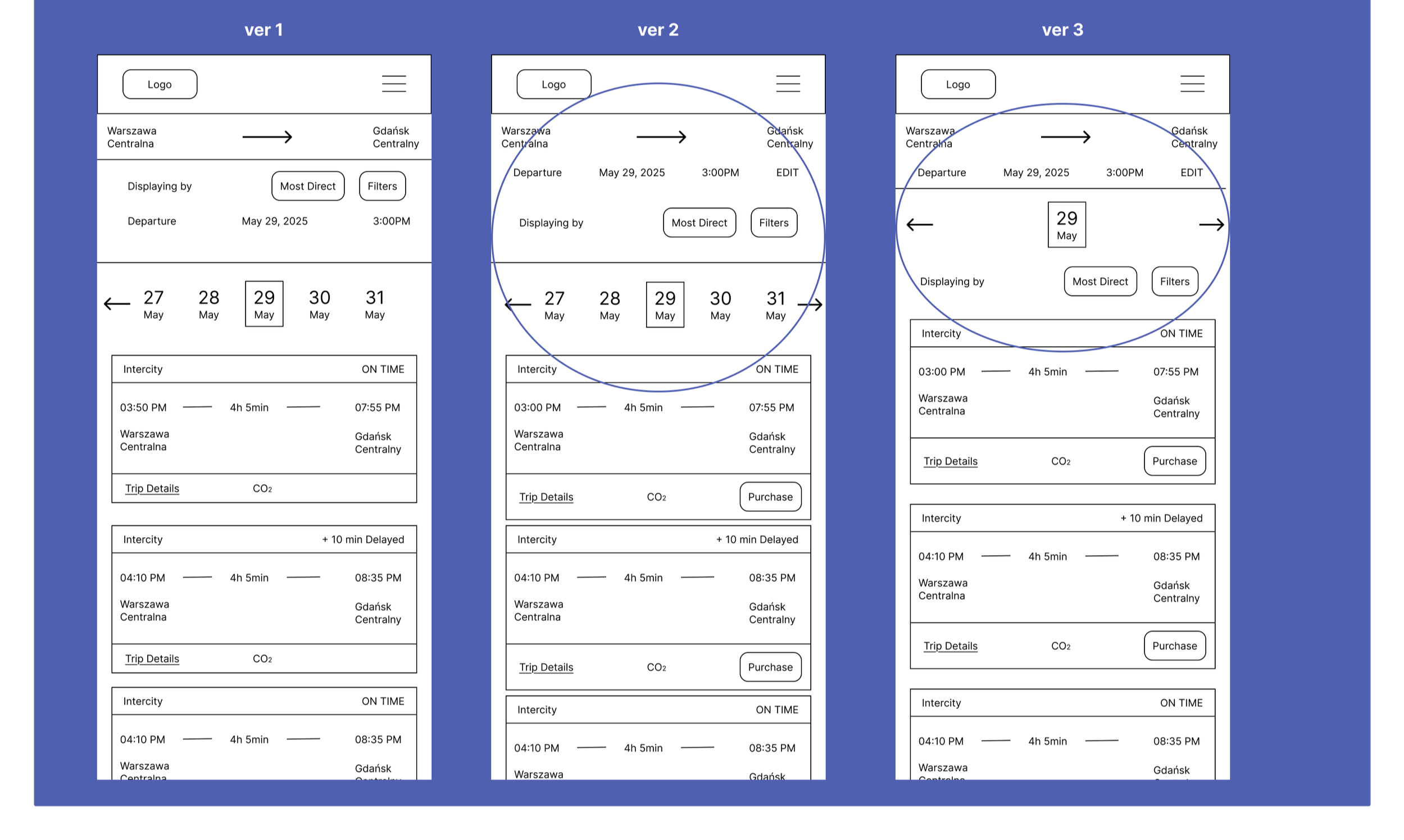
landing page
Most voted for ver 1
Feedback: Version 1 offers a much clearer visual hierarchy.
result page
Most voted for ver 2
Feedback: It’s more readable and has a layout similar to a flight booking page.
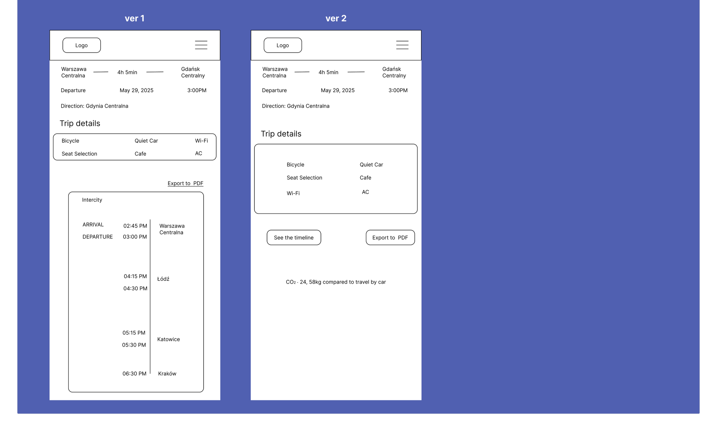
train details
Most voted for ver 1
Feedback:Everything is visible right away, but where is the delay information?
#1 usability test: key findings
“Trip Details” and ‘CO2’ don’t clearly communicate what info is inside.”
“ There’s no information about price.”
💡
hold on!
and what about responsiveness?
Since this was my first experience with responsive design, I initially focused solely on low-fidelity wireframes for the mobile version, as interview feedback indicated that users accessed the mobile website much more frequently to search for trains. After consulting with my mentor, I recognized the importance of also incorporating desktop responsiveness into the project.
Since I was lacking low-fidelity wireframes for desktop screens, I developed both mobile and desktop wireframes for hi-fidelity stage and ensured the screens are responsive.
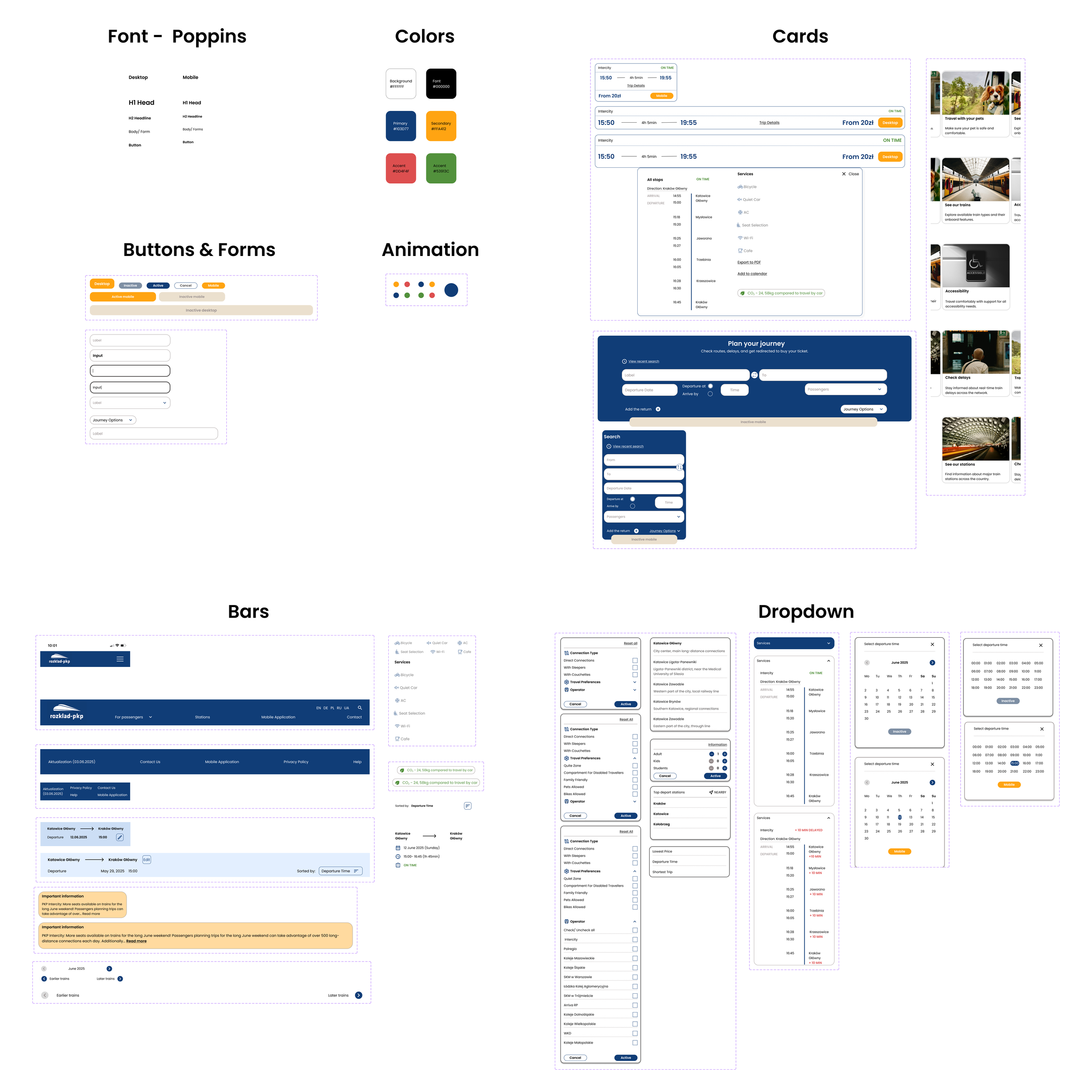
redesign: ui components & pkp brand adaptation
In this project, I developed a comprehensive design system tailored to the PKP brand identity. While maintaining the original PKP logo to preserve brand recognition, I adapted the color palette to reflect the company’s official colors more effectively. Additionally, I redesigned key UI components such as buttons, forms, and navigation elements to improve usability.
evolving the design: from wireframes to visual identity
In the initial versions of the high-fidelity designs, I aimed to stay as close as possible to the original visual style of the PKP website. This approach helped ensure visual continuity and user familiarity, especially for returning users accustomed to PKP’s current interface.

💡idea
upfront pricing: I introduced “from” pricing because interviews showed it’s a key decision factor, helping users quickly assess a connection’s attractiveness.
dynamic pricing: The price adjusts based on the number and type of passengers (adults, children, students) for a more accurate estimate.
managing expectations: Labeling the price as “from” clearly signals that the final amount may vary on the carrier’s website.

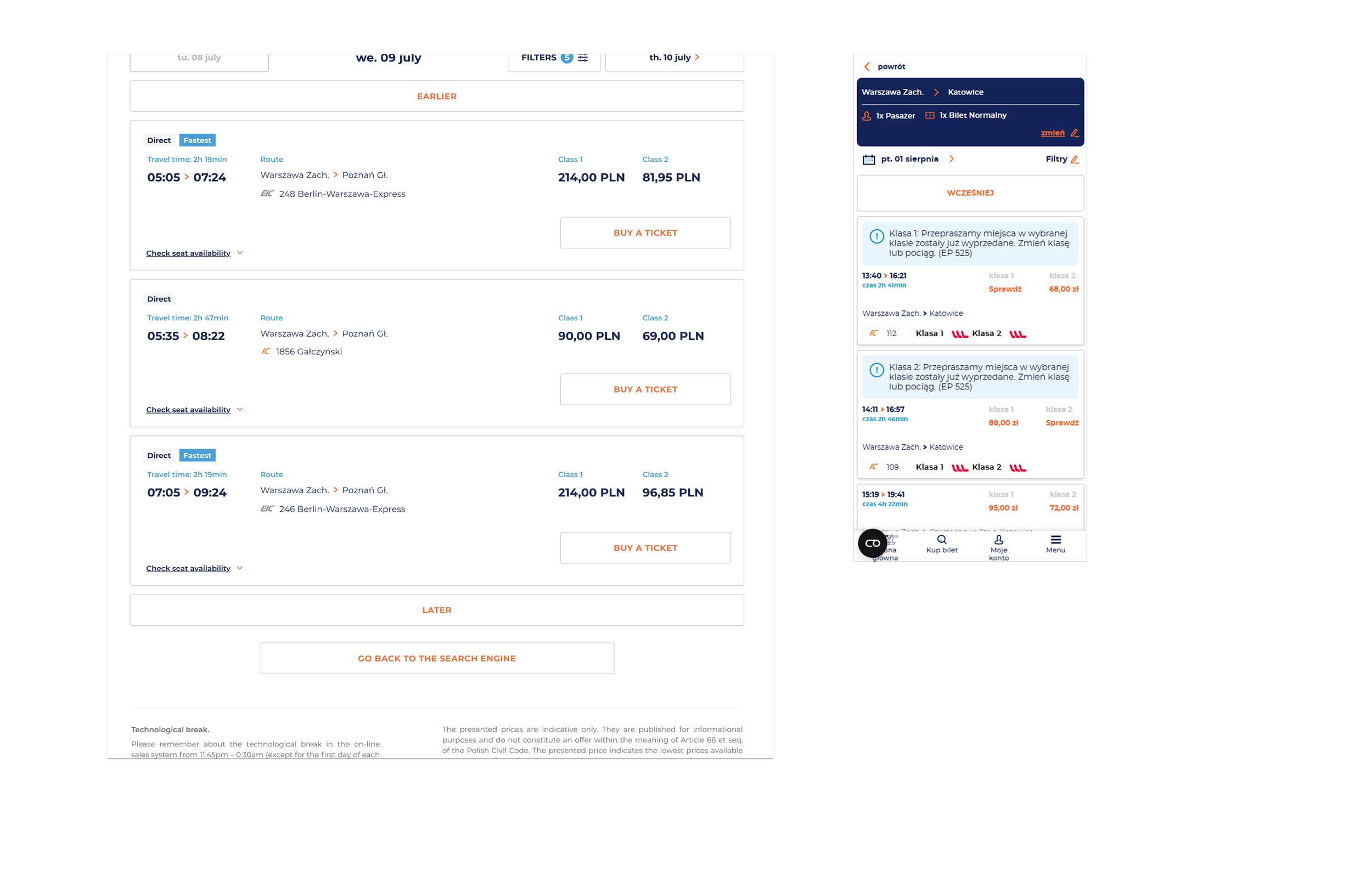
#2 testing: high-fidelity wireframes in action
overview:
Ensure users can easily understand searching for a train connection, using filters and checking for delays.
For the purposes of the project and due to limited time, I only tested the mobile version.
key iterations
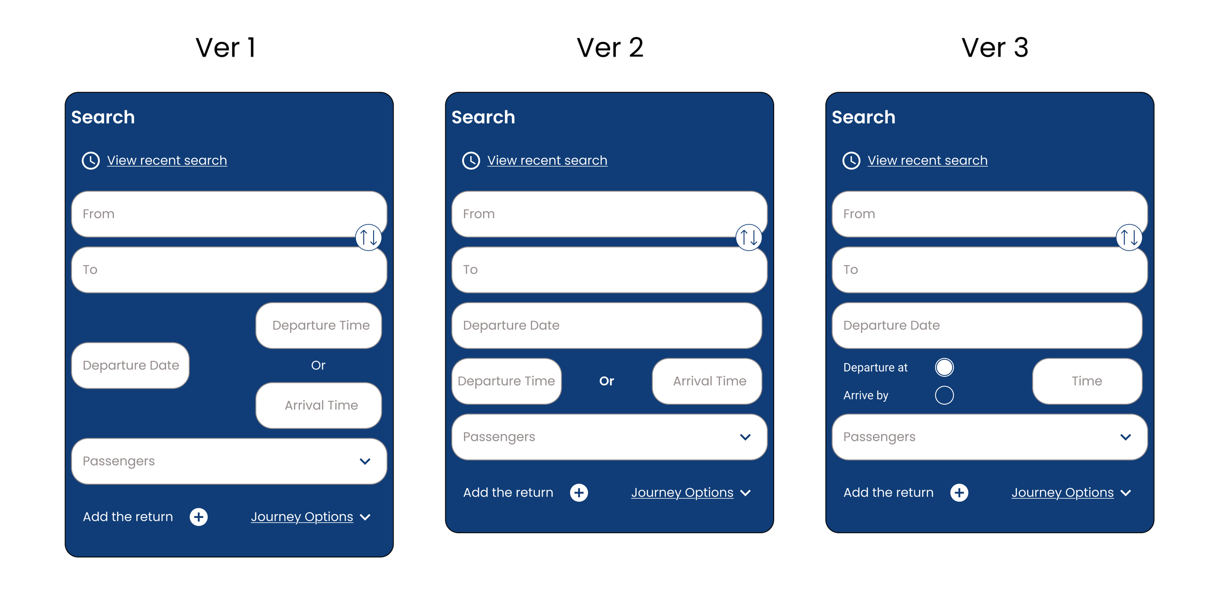
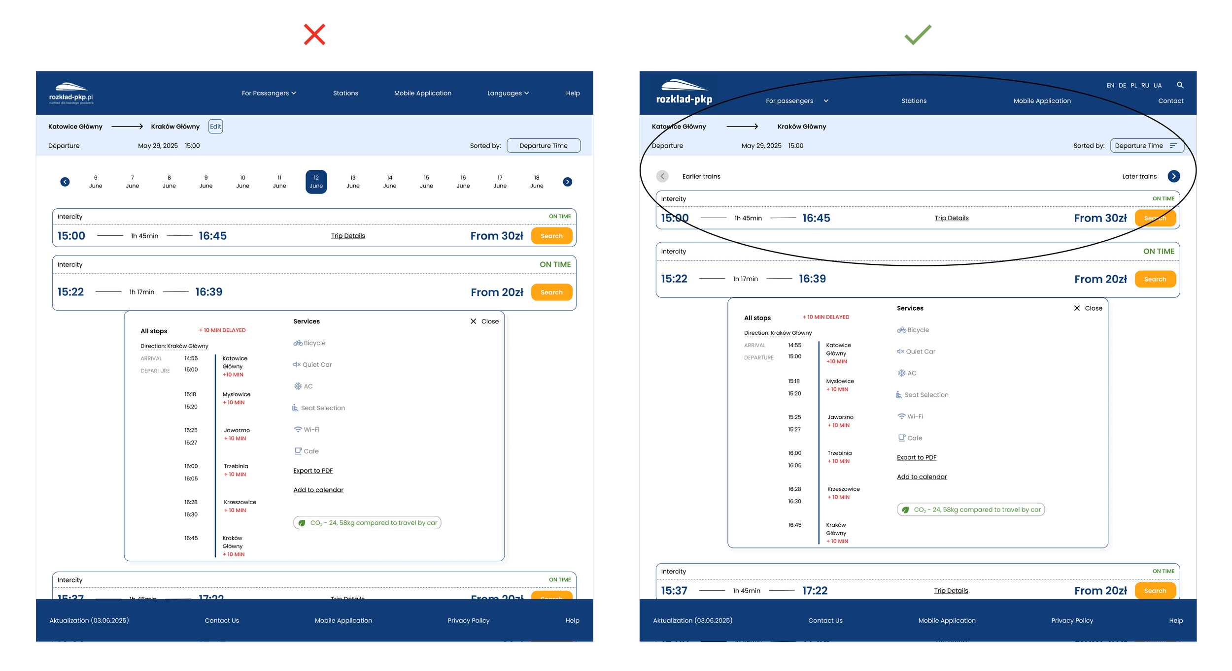
the problem: The design lacked a clear "search by arrival time" feature.
the process: I tested three iterations and discovered that separate input fields confused users.
the outcome: Version 3 simplified the search process. This proved that feedback and clarity are the keys to effective design.

simplified search: Suggesting only main stations reduced errors and decluttered the UI.
enhanced readability: Increased font weight and size improved scannability in input fields.
streamlined layout: Visually separating promotions from the footer reduced clutter and improved focus.
critical alerts: Added a high-visibility yellow banner for essential travel updates.

Price Sorting: Added a sorting icon to help users quickly find the cheapest connections.
Simplified Navigation: Replaced the date scroll with intuitive "Earlier/Later" buttons to match user habits.
Stable Layout: Optimized the design to prevent long station names from breaking the interface.
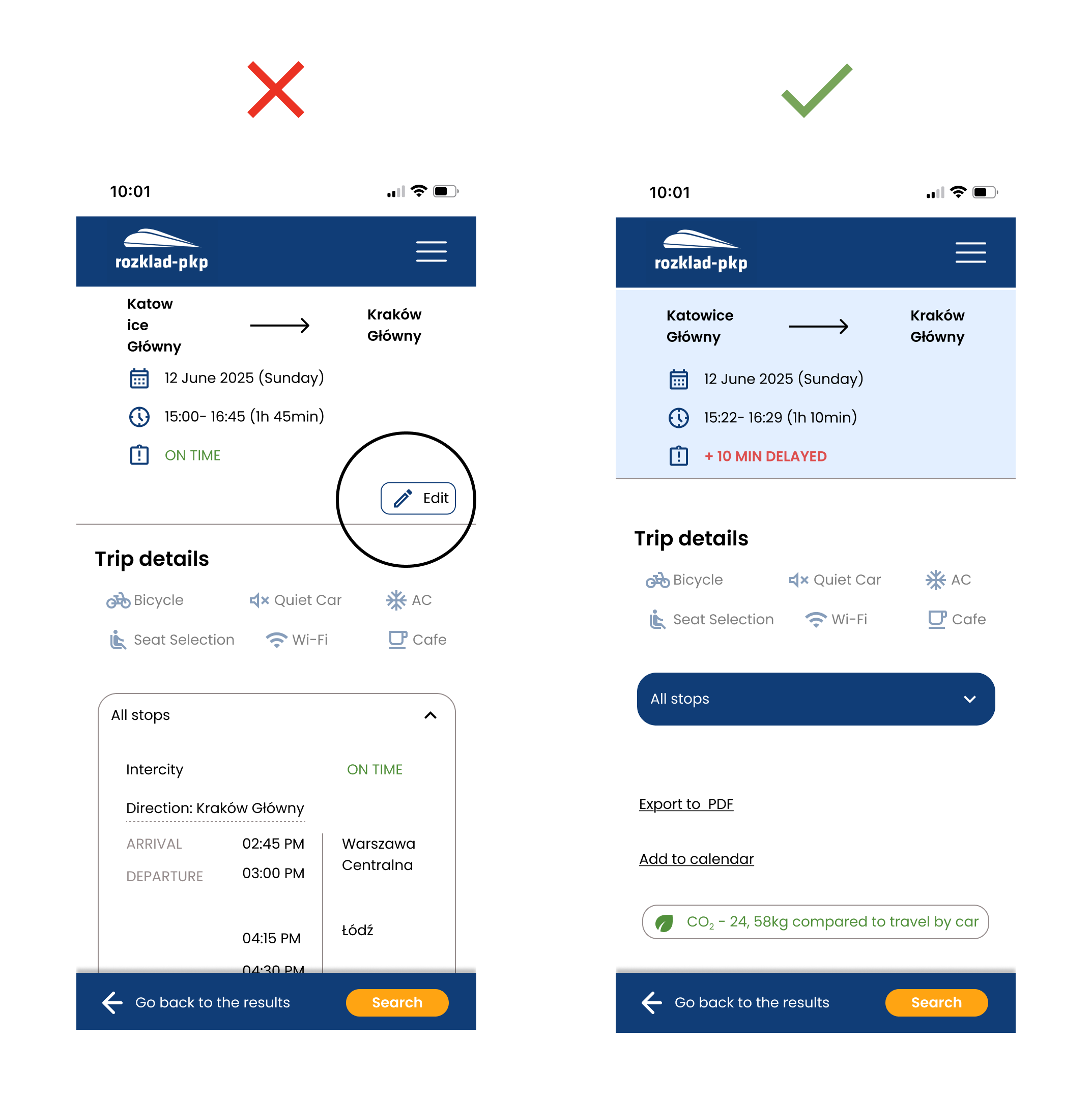
Simpler UI: Removed the unused "Edit" button, as users naturally preferred navigating back to modify details.
final design
reflections
This project was like a box of chocolates – every time I discovered something new. Sometimes it was interesting, and other times it required me to dedicate more time to properly 'chew' and 'digest' it. I learned a lot while preparing this project, primarily that good initial research is fundamental.
Also, designing responsive wireframes for both desktop and mobile so that everything was cohesive, aesthetic, and at the same time user-friendly, while also considering the specifics of the industry and remembering that I was only redesigning an existing website, not building it from scratch according to my own preferences.
trade-offs i had to make
functionality vs. simplicity/time: Initially, I wanted to add many new features, but I had to forgo some to maintain interface simplicity and meet the set timeframe.
ideal solution vs. existing system limitations: I had to adapt the design to local specifics and the capabilities of the existing website, instead of implementing ideal but unfeasible solutions.
all user groups vs. priority groups: I decided to focus on "Existing User" and "New User to the City," so I did not delve deeply into addressing the needs of "Travel Agents."
what i liked about this project
I appreciated that this project allowed me to visit various travel websites as part of my research. I searched for exotic train connections and observed how different railway websites reflected the specific travel characteristics of various countries. I noticed that certain solutions, despite appealing to me on the original sites, on the original sites couldn’t be directly adapted to the Polish context, and the design had to adapt accordingly. (An example of this is the way hours or dates are recorded in English-speaking countries, or the abbreviations for cities where stations are located in the USA—in Poland, we don't use such abbreviations, which directly impacts the design of longer input fields.).
if i can do it again
Definitely, if I'm tasked with designing for both desktop and mobile,.I will approach both desktop and mobile more simultaneously in the future. In this project, I primarily focused on mobile because that's what the project mainly required of me, somewhat neglecting desktop. I later realized thatthis approach turned out to be less efficient.